After acquiring the Kickdynamic personalization and content automation tool, the team quickly realized the product had serious usability issues that were difficult to fix. Most Kickdynamic customers needed help from Account Managers to accomplish their goals, which was sustainable for a small customer base but not scalable for a large volume of self-serve users. Additionally, the technology behind Kickdynamic was built in .NET, whereas Litmus used Rails as its standard framework. This meant the engineering team would either have to navigate unfamiliar code with a steep learning curve or rebuild using known tools for faster, more reliable development.
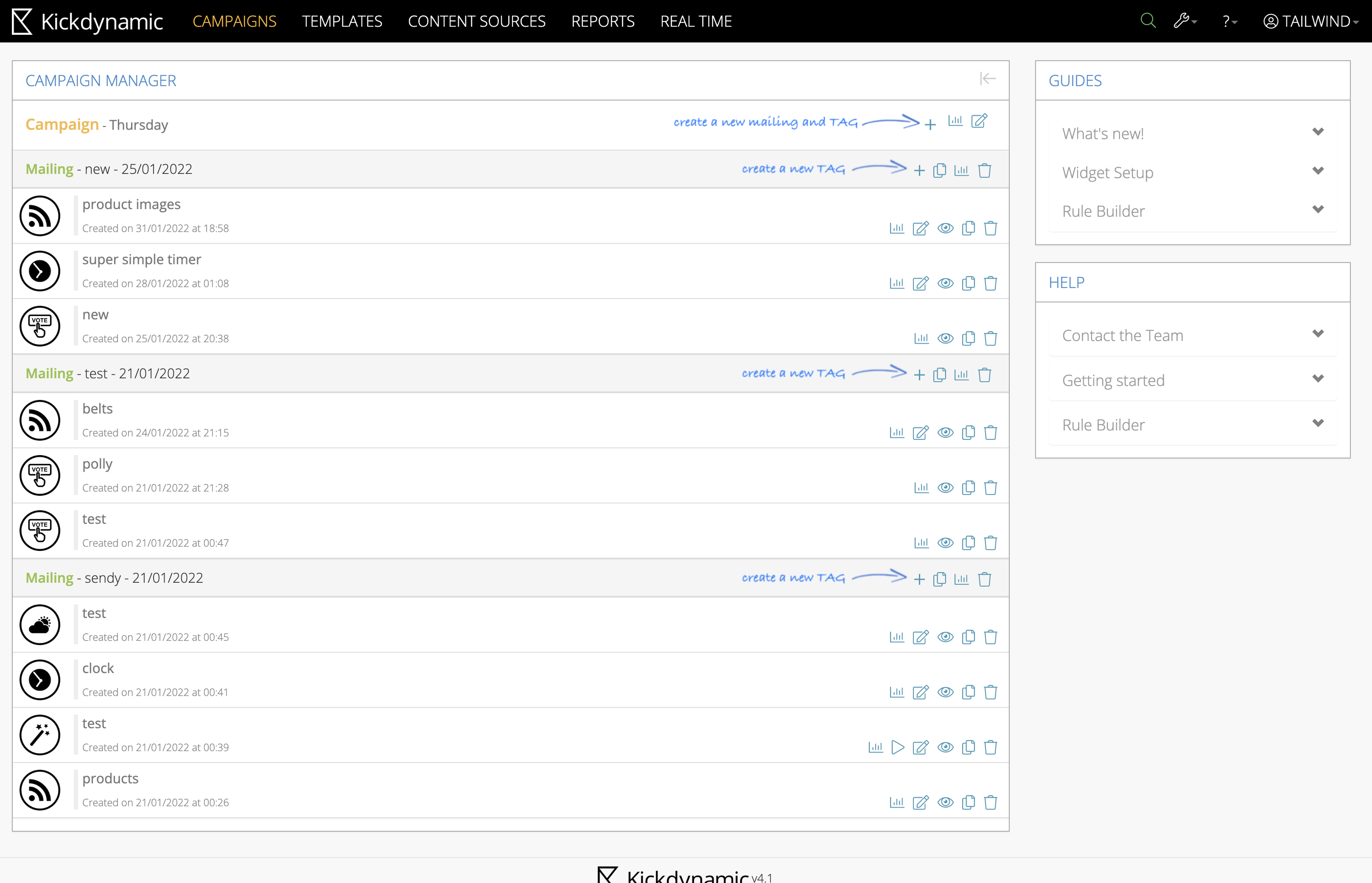
The newly acquired product was not scalable, suffering from severe usability issues and significant educational gaps. One of the main usability challenges was helping users quickly understand what the product actually did.
By laying out the full end-to-end user flow in Kickdynamic, we were able to spot key pitfalls to avoid: dead ends, back-and-forth loops, ambiguous labeling, missing context, lack of explanations, reliance on recall instead of recognition, unhelpful or missing error handling, and inconsistencies between flows and UI elements. This process helped us design a much more seamless experience in Litmus Personalize Essentials.

The Kickdynamic personalization tool had a fragmented setup: users first had to create a template in one area, then navigate elsewhere to build a campaign, start a new piece of content, and finally apply the template. Additionally, users had little visibility into the available content types or how they could be used effectively.
The team decided to pivot from redesigning Kickdynamic and set a goal to design and launch, within two quarters, a lightweight version of the product that would be intuitive and easy to use, with minimal setup and core capabilities for styling.
Since the launch in September, the goal was to have 375 accounts actively using Litmus Personalize by New Year's, and to generate 1 million impressions — where an impression is counted each time an email recipient views a piece of content created by a Litmus customer.
We put together a competitive analysis and inspiration board to get a better sense of the personalization tool landscape and spot best practices. Looking at design patterns and user flows from other tools helped us find common pitfalls and see where we could do better.

Exploration of the end-to-end Litmus Personalize user flow when integrated into the core platform.

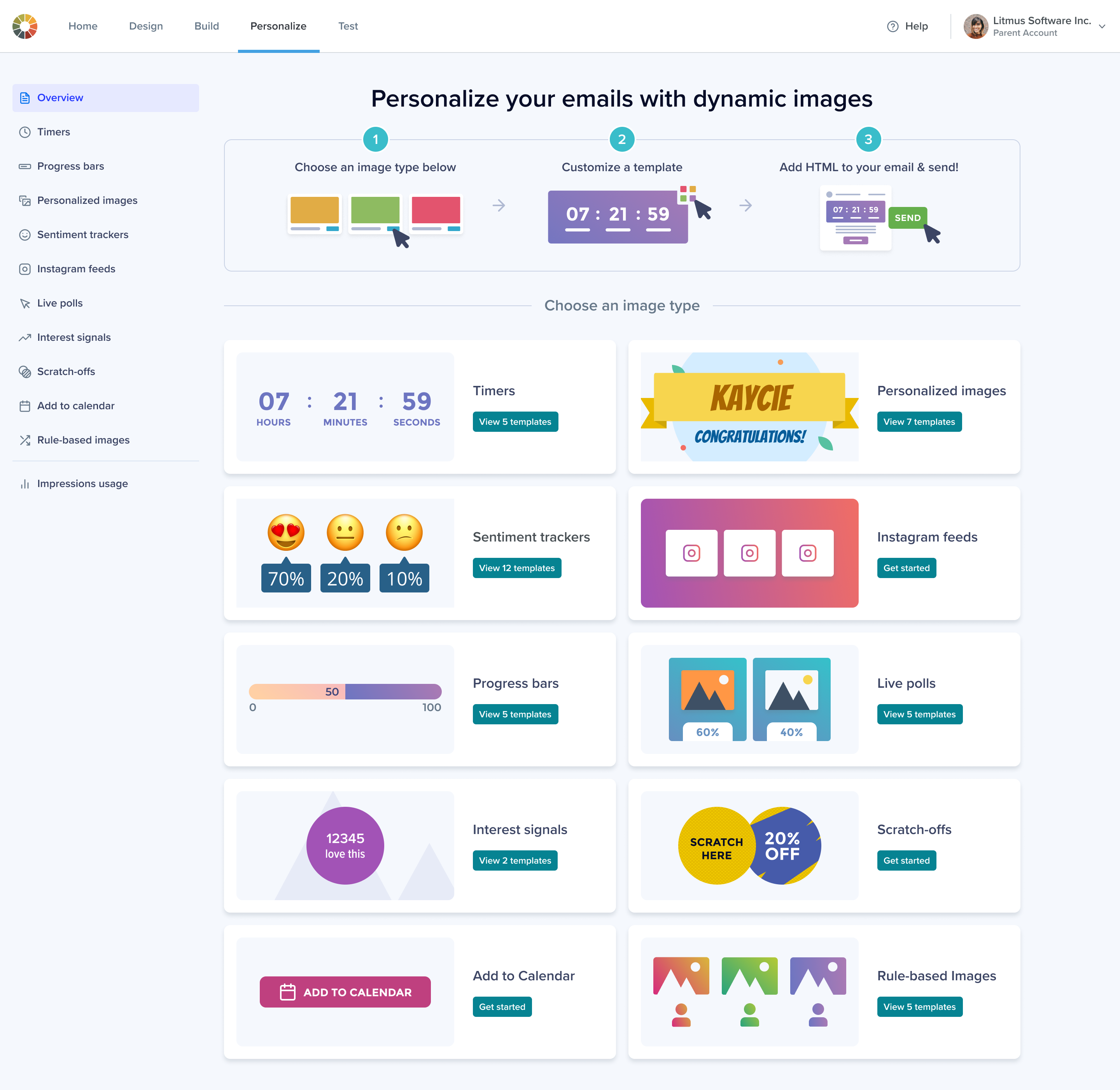
The first iteration of the Litmus Personalize homepage.
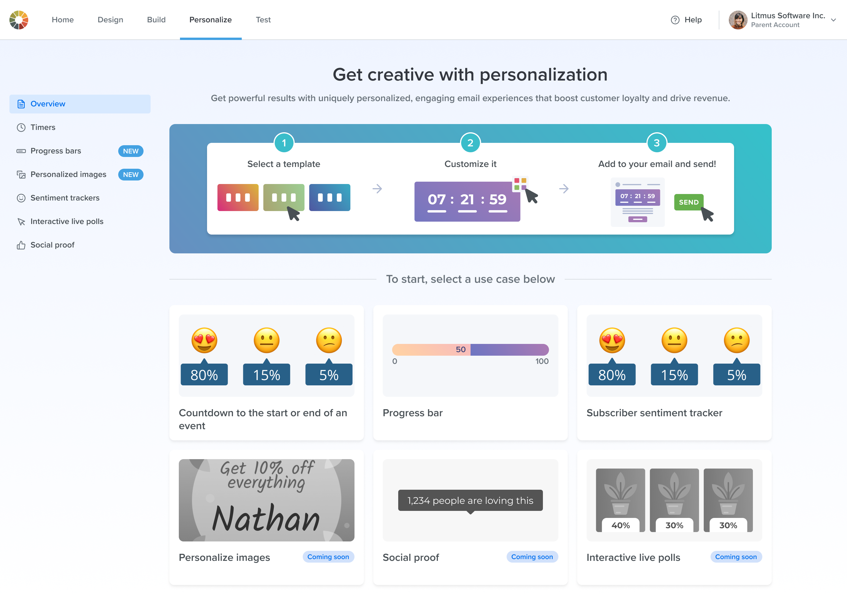
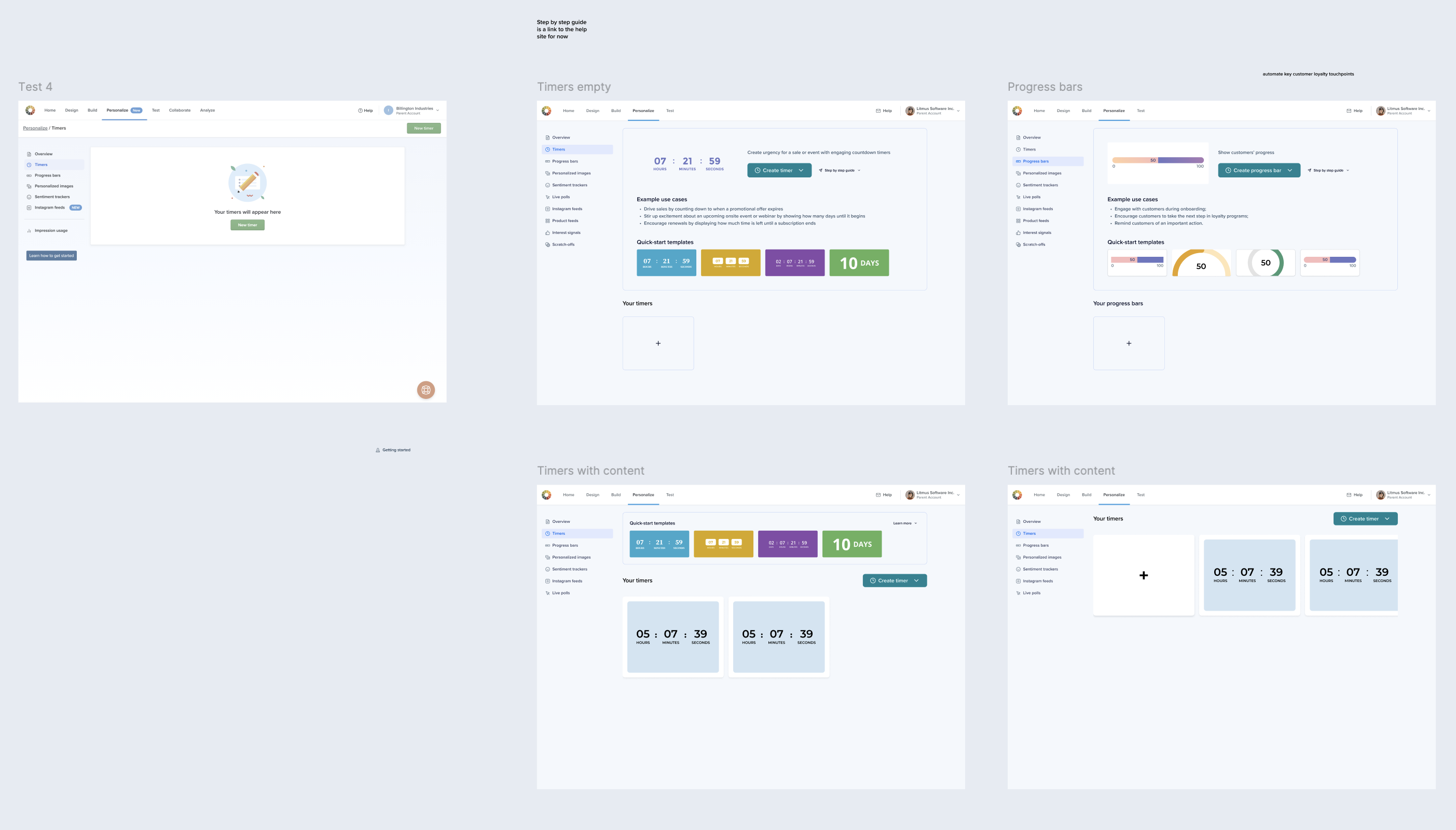
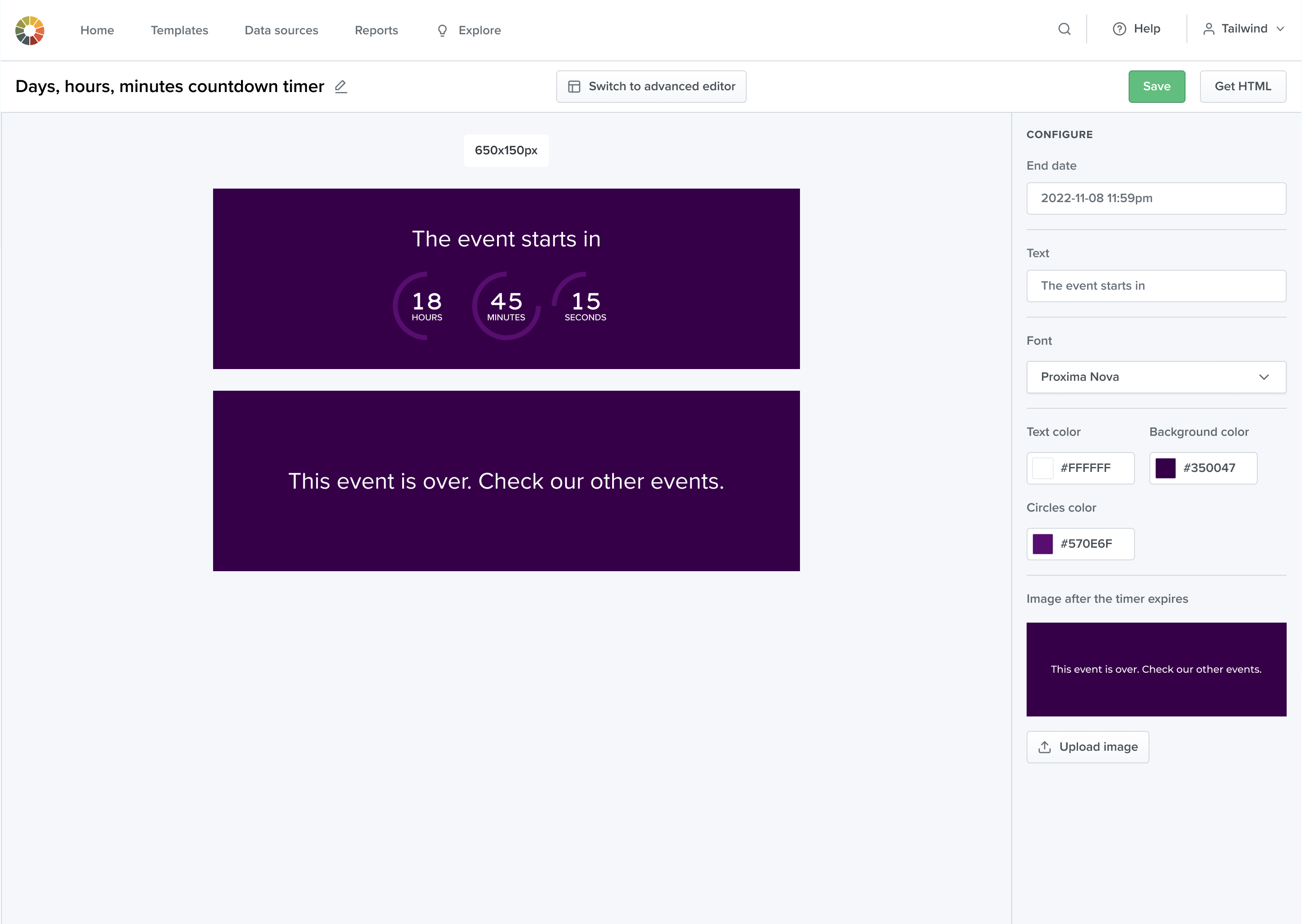
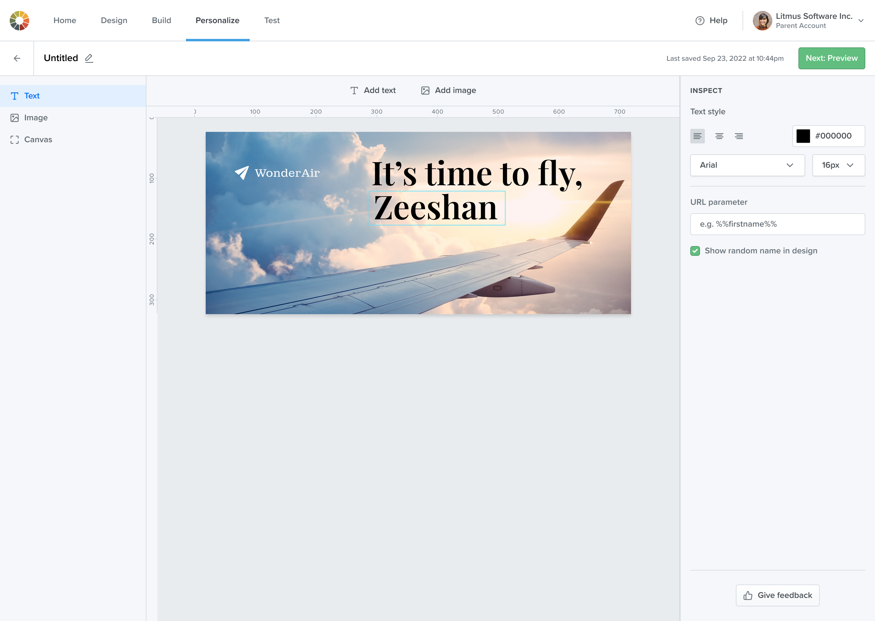
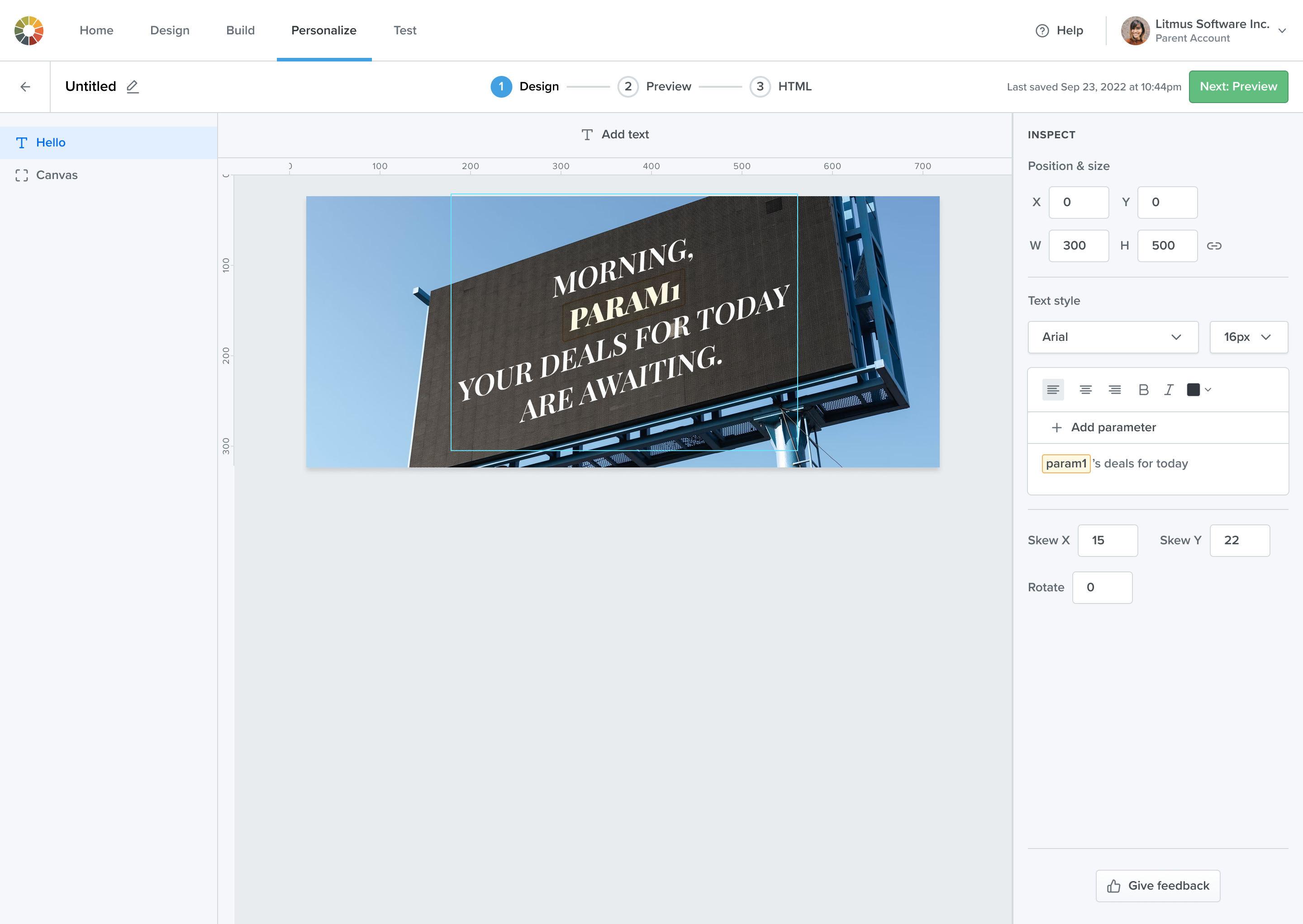
High-fidelity user flows were created, starting from the Index page for each content type and guiding users through authoring content to generating HTML. A consistent three-step flow in the Editor was maintained across all content types (at the time, still referred to as "content types," since naming hadn't been finalized). In September 2023, the product launched with four widgets, and within a year, the number of widgets grew to a dozen.
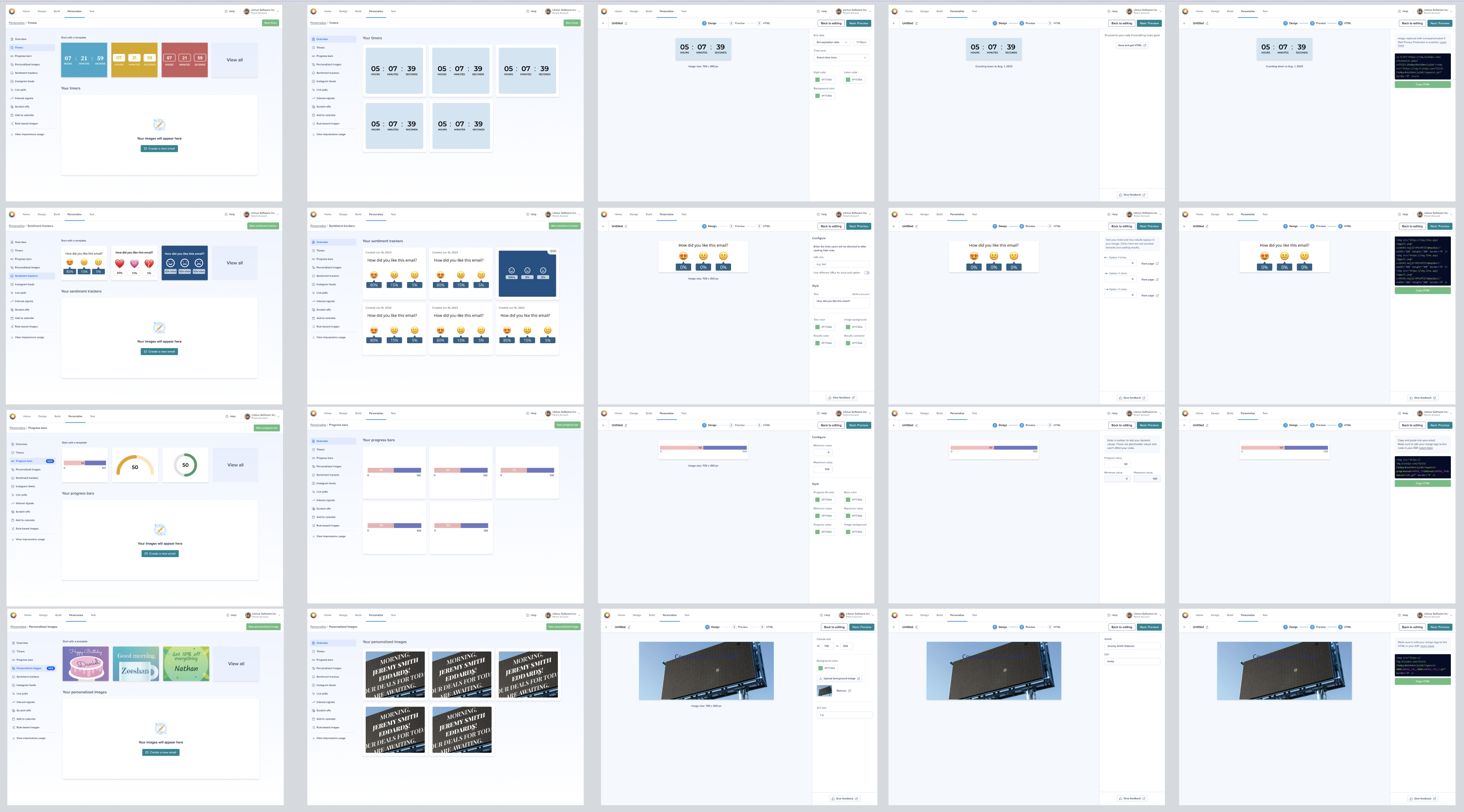
An exploration of empty states and index pages for each widget type, with a focus on educating users.
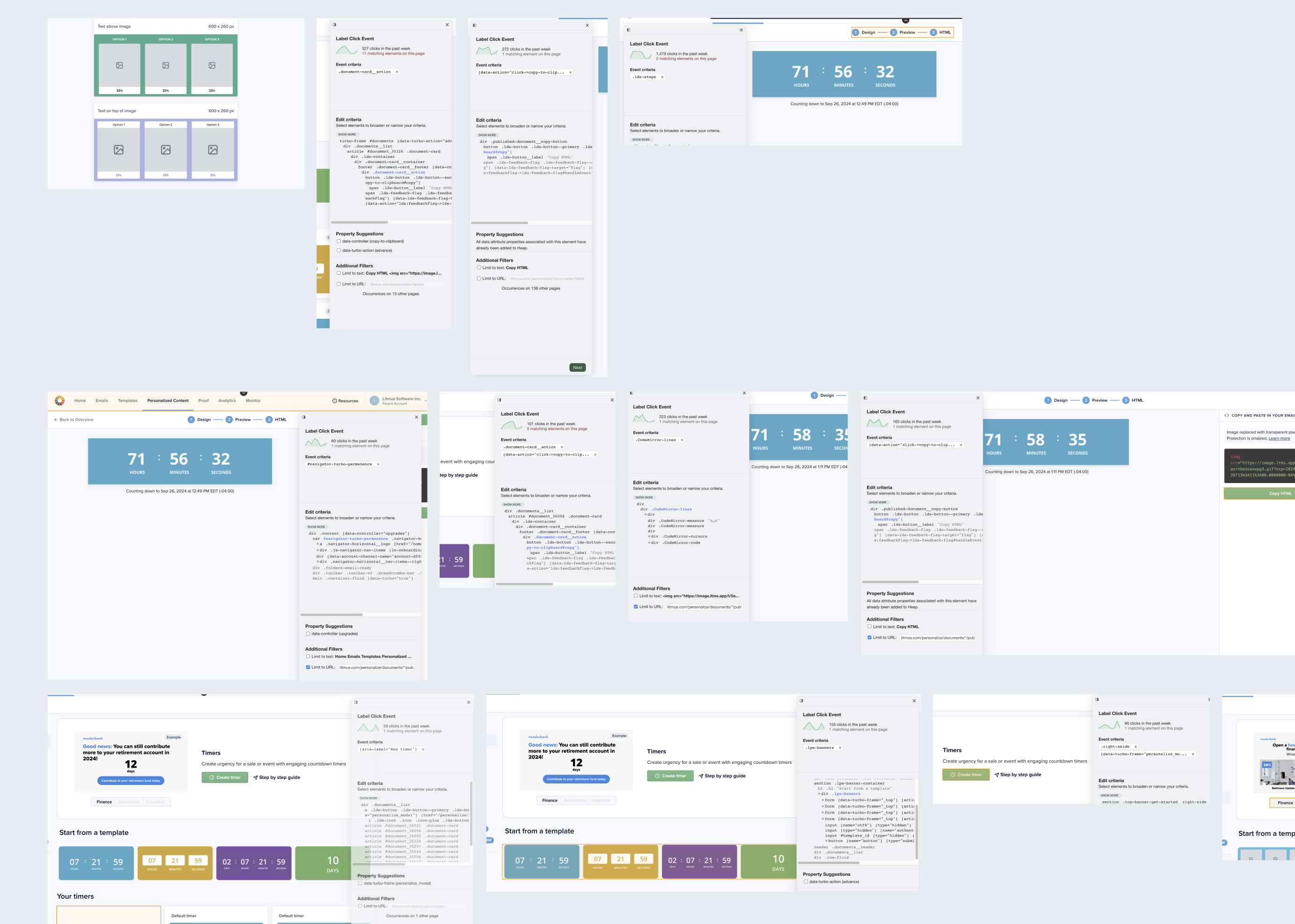
Using Heap analytics, user interviews, and feedback from the Customer Success team, we captured usage patterns across various UI elements to spot opportunities for improvement. Key findings included:


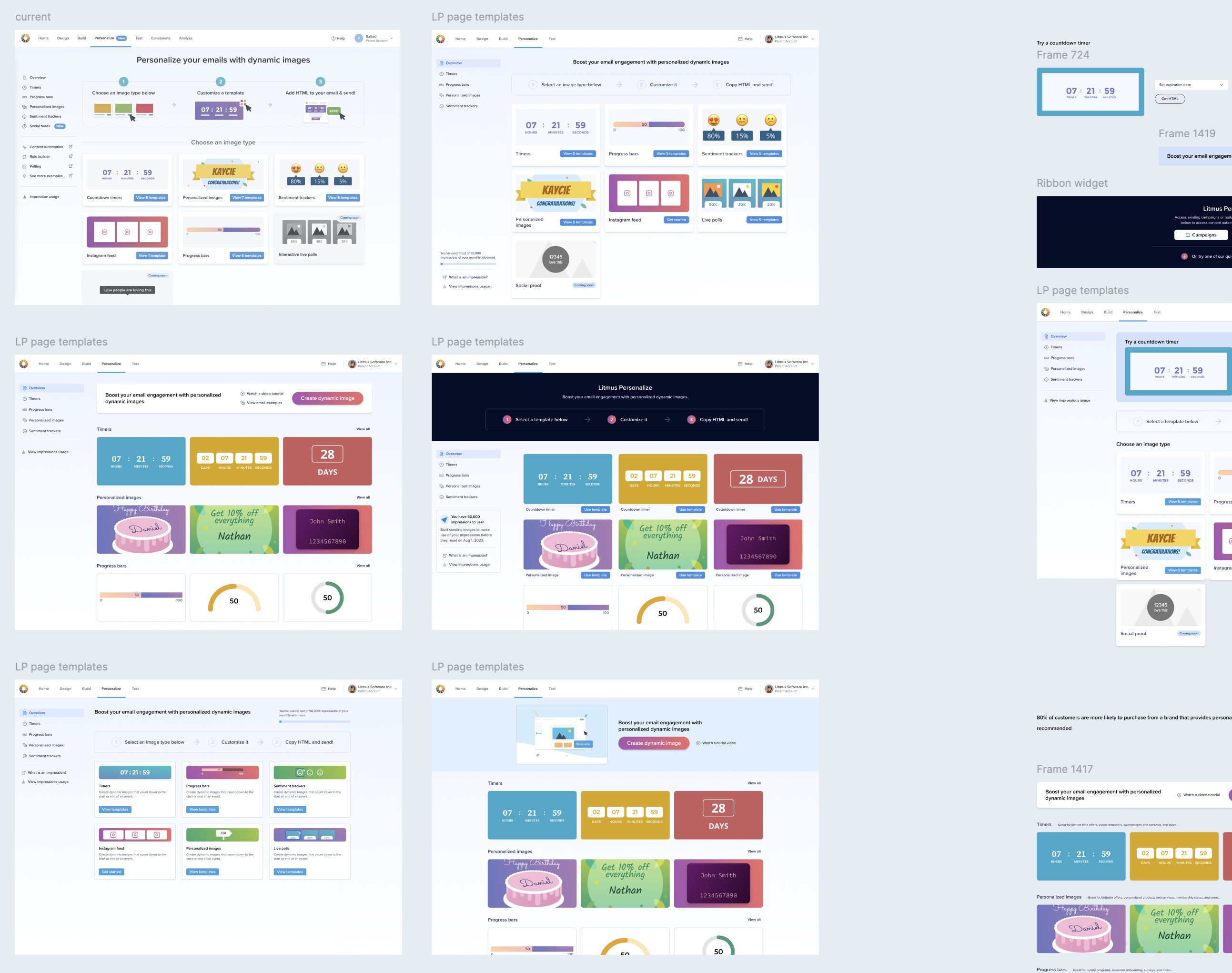
An exploration of the Litmus Personalize homepage, focusing on the layout and organization of templates. The goal was to create a more intuitive and user-friendly experience for users, allowing them to easily navigate and find the templates they needed.

An exploration of homepage layouts and template organization aimed to enhance overall structure and usability. Usability testing revealed that some users were unaware that the card elements were clickable. To address this, a call-to-action button was added to the cards, which significantly improved the user flow.
An exploration of Content Editor layouts and UI elements tested with users.


Additional problem to solve: with the new product in development, both the Kickdynamic product (Litmus Personalize Pro) and Litmus Personalize Essentials needed to remain available for Pro customers, many of whom were confused about the difference between the two. Several design options were explored to address this, focusing on how to visually communicate the duality between the two products.
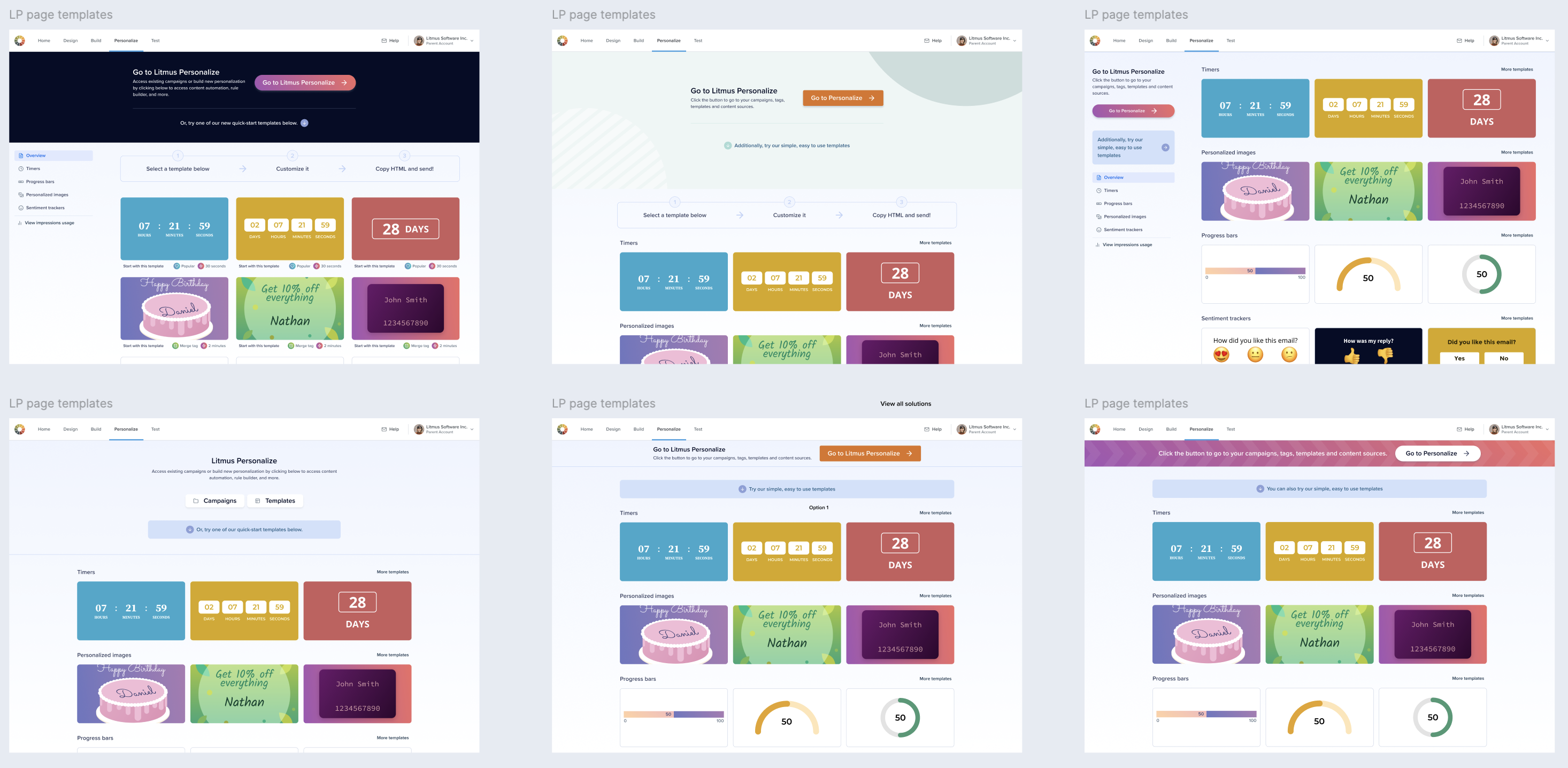
One of the iterations of the Litmus Personalize homepage based on the data analysis, VWO tests, and customer feedback.

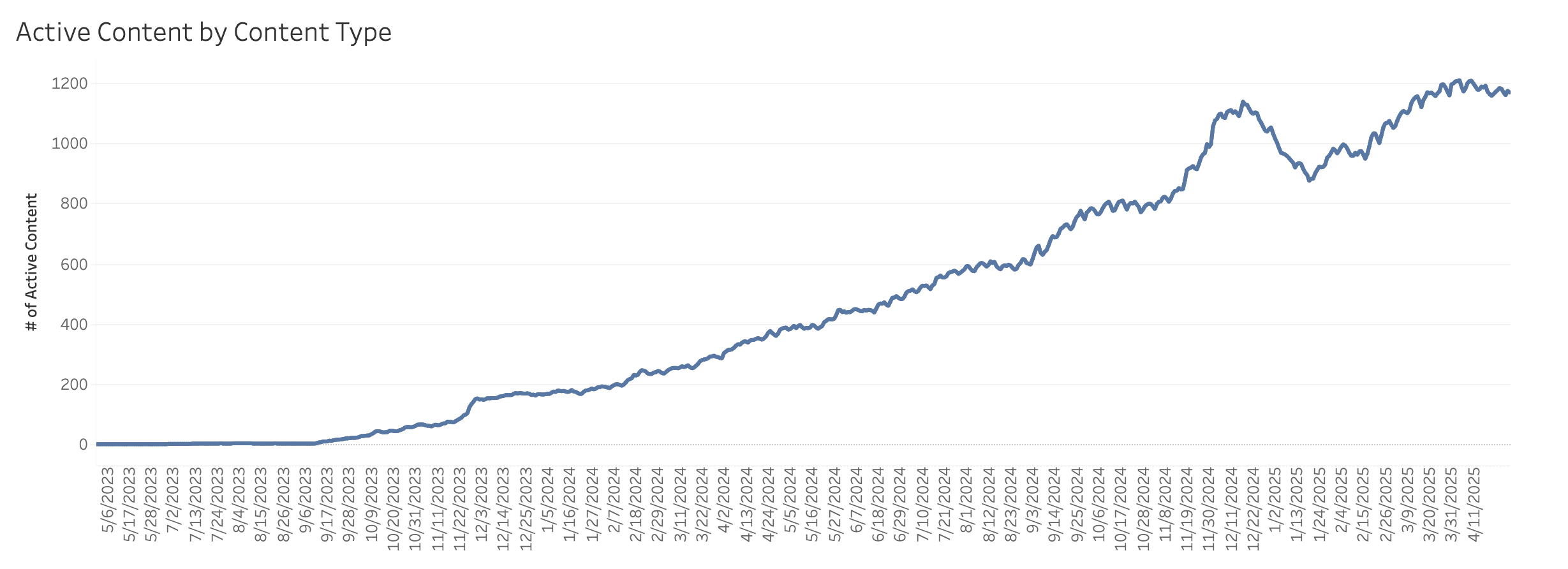
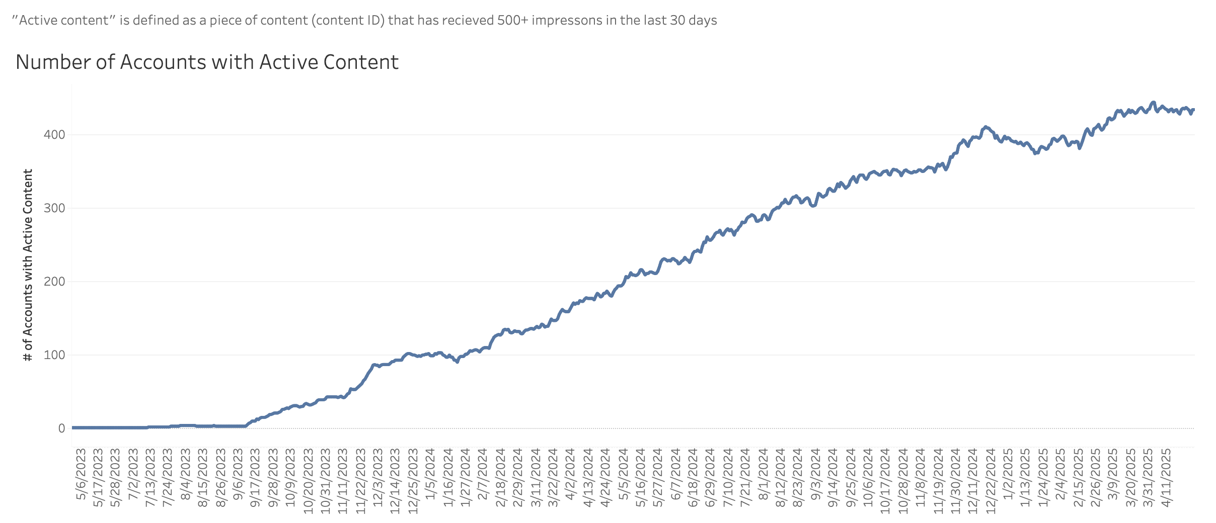


We began by measuring key feature KPIs, including engagement and user behavior patterns. These insights helped us expand Litmus Personalize and build new features based on customer feedback and market trends. After launching each new content type, we tracked its performance to inform further growth and prioritize future development.