Modular email building
I led the design of a modular email building feature at Litmus, enabling both technical and non-technical users to build emails using reusable components. This case study outlines the problem, process, key design decisions, and outcomes.
Problem
Creating emails in Litmus was inefficient for non-technical users. While developers could build reusable modules, there was no streamlined way to use them in Visual Editor. Teams had to memorize module names and manually insert HTML, leading to errors, inefficiencies, and poor adoption of existing tools.
Users & Research Insights
Through Continuous Discovery interviews, we learned that:
Non-technical users struggled with HTML-based workflows.
Email developers wanted faster content edits without breaking layouts.
Customers were frustrated with ESP builders and sought better alternatives.
I want to enable non-technical people at my company to build their emails from templates and modules I control.
Team & Collaboration
Product Manager: planning, strategy, and stakeholder communication
3 Engineers: tech spikes, feasibility, implementation
Design Director: design quality oversight
UX Researcher: recruitment, testing facilitation
Director of Engineering: dependency management, quality assurance
My Role
Defined the MVP and future vision
Led research, ideation, prototyping, and usability testing
Created high-fidelity mockups and flows
Maintained alignment with design system and engineers
Provided ongoing implementation support and documentation
Process
UX research, competitive analysis, and ideation sessions
User journey mapping and interaction prototyping
Usability testing for "Drag & Drop" and "Organizing Modules" features
Iterative development with design system integration
Selected design artifacts from the process
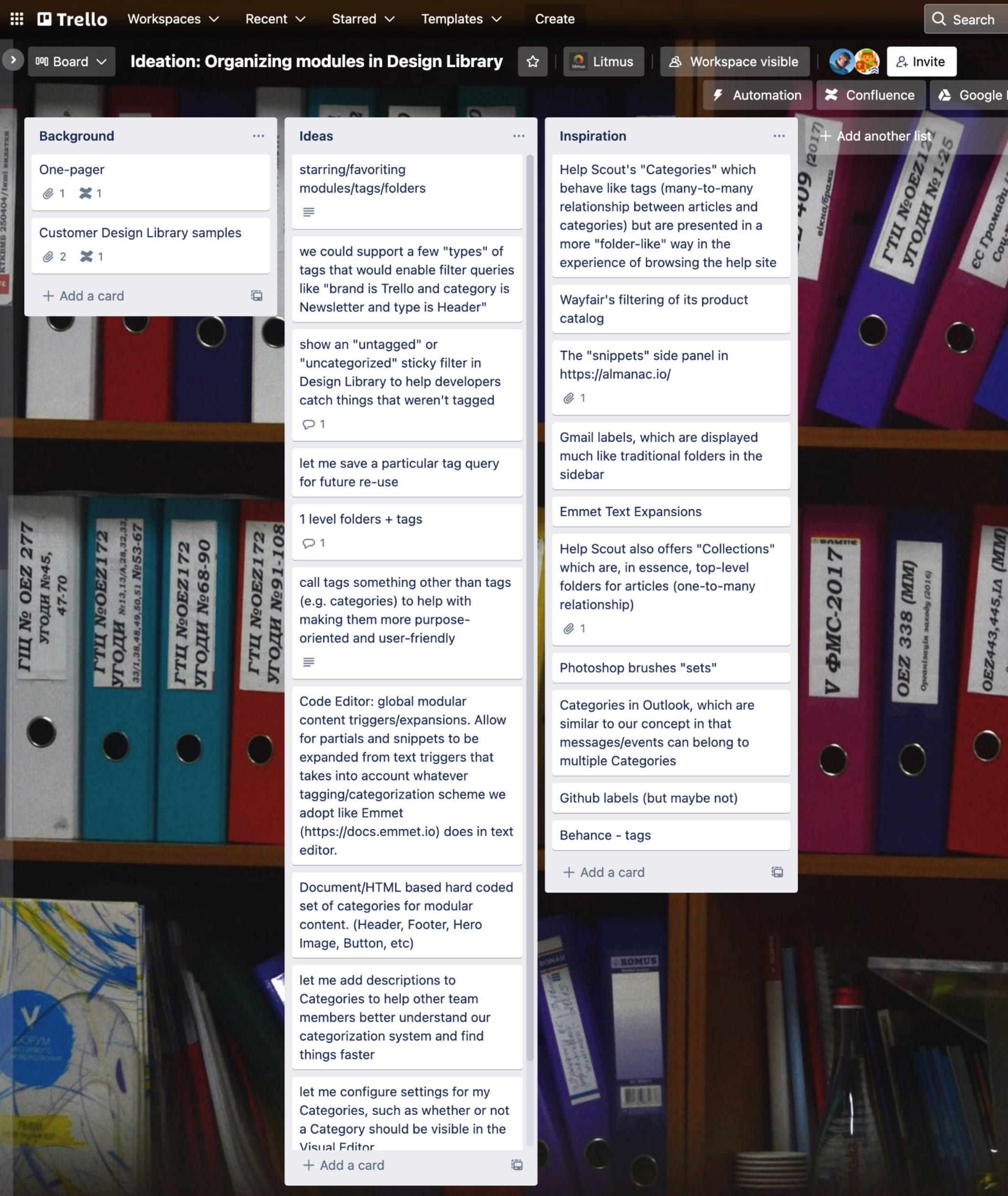
Competitive analysis and inspiration board
Ideation session with engineers and marketing
Initial flowchart of functionality
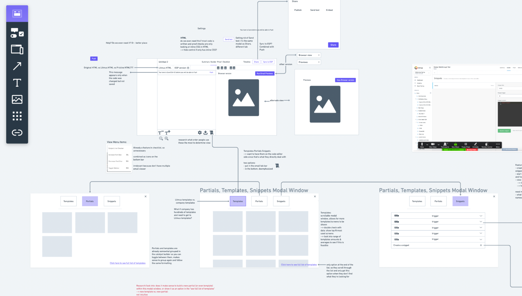
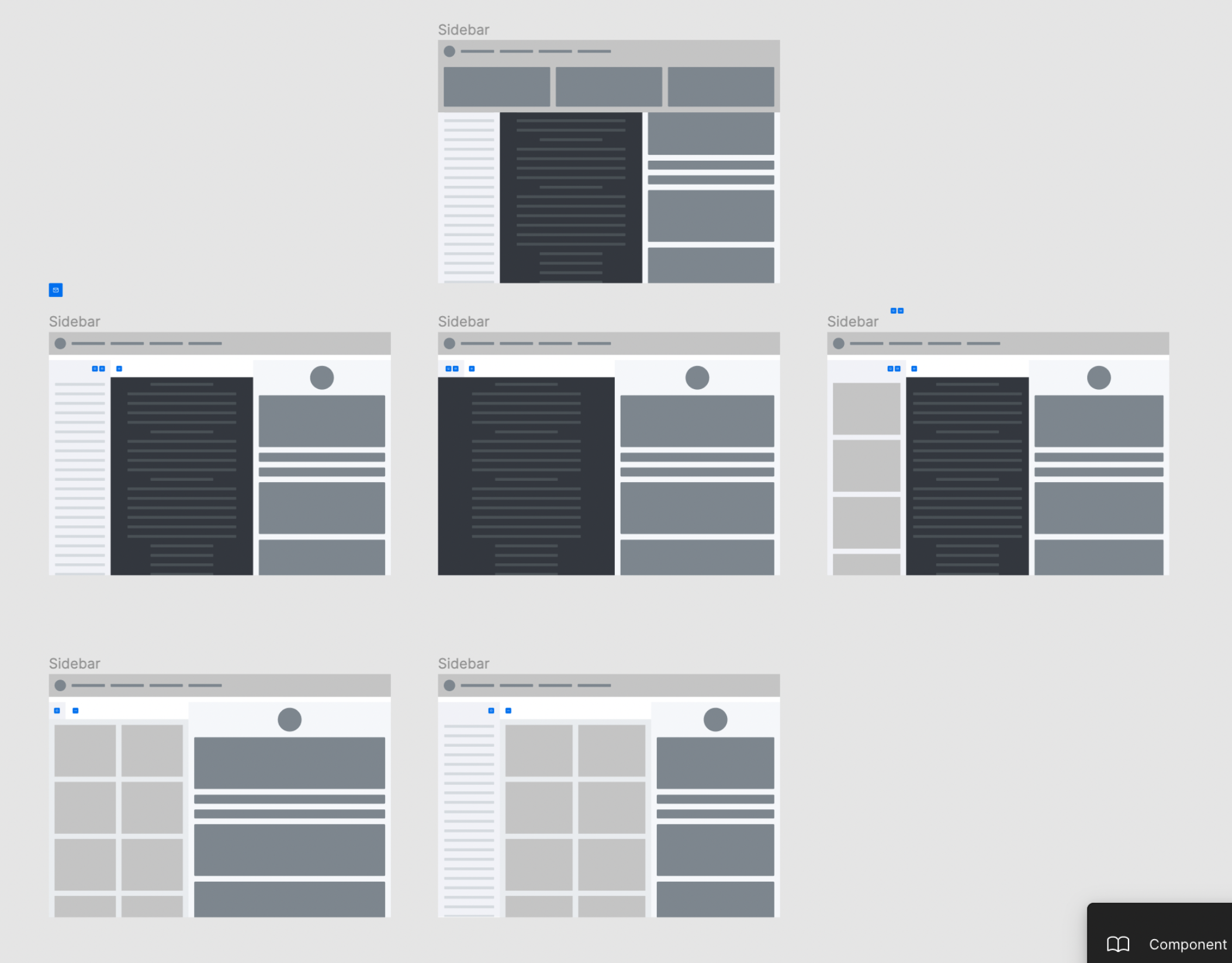
Layout and interaction explorations
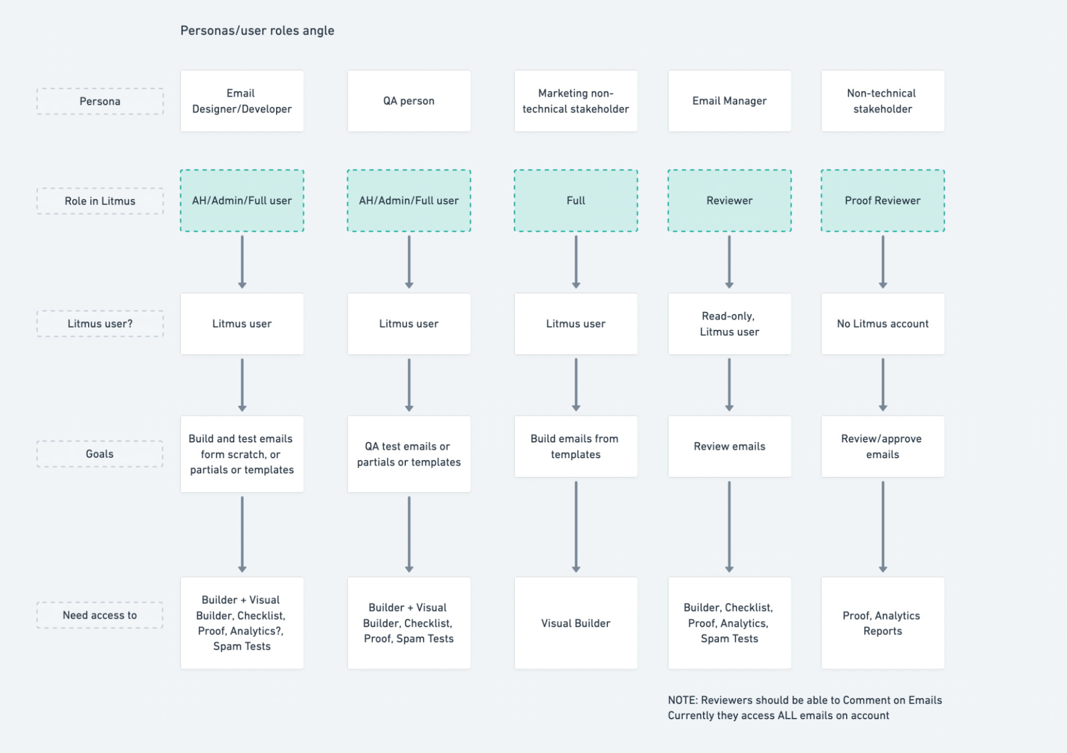
Persona and user role impact study
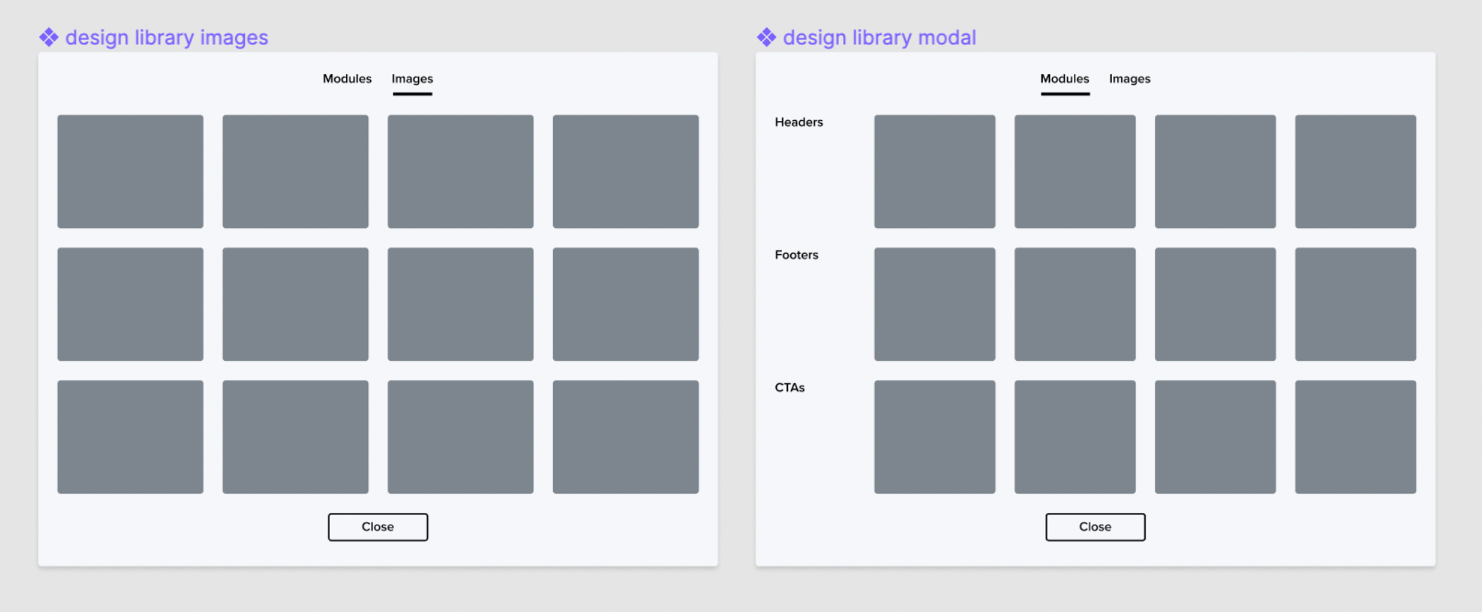
Modal window explorations
Timeline & Rollout
Developed iteratively over two quarters
Quarterly releases gave Marketing time to plan promotions, create materials, and train Sales and Support
Built in a staging environment with features behind beta flags
Phased rollout: from beta users to full customer base
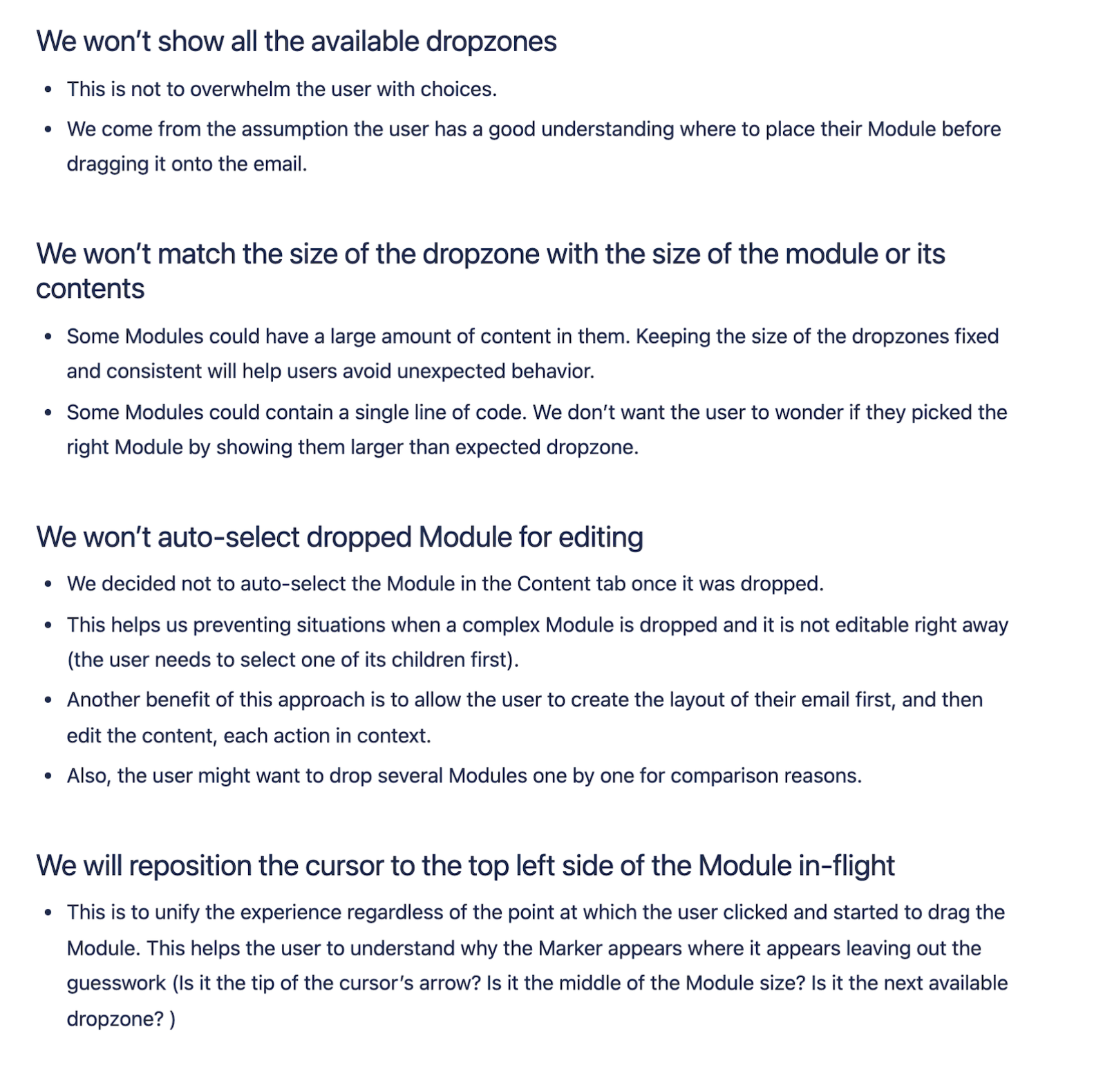
Key Design Decisions
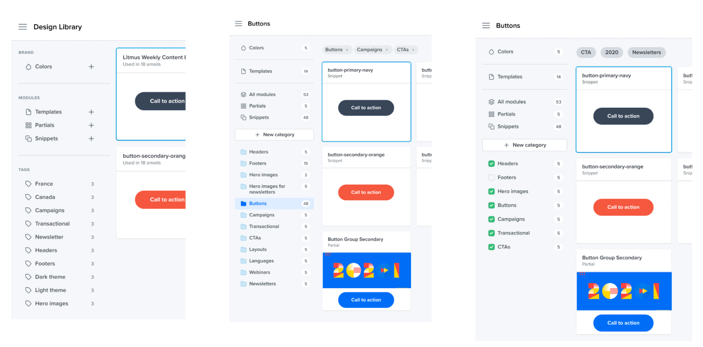
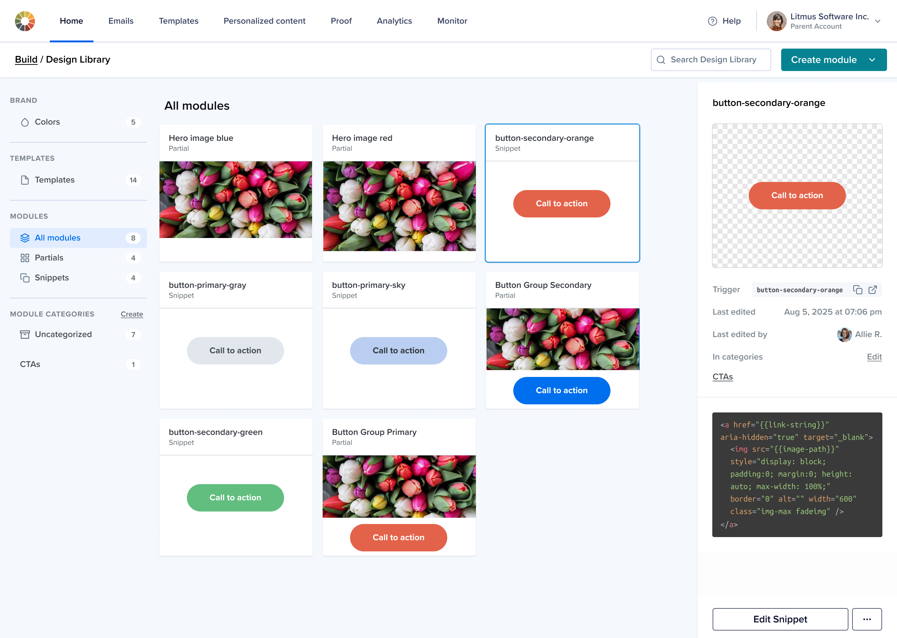
Categories:
Better than folders (too rigid) and tags (too loose)
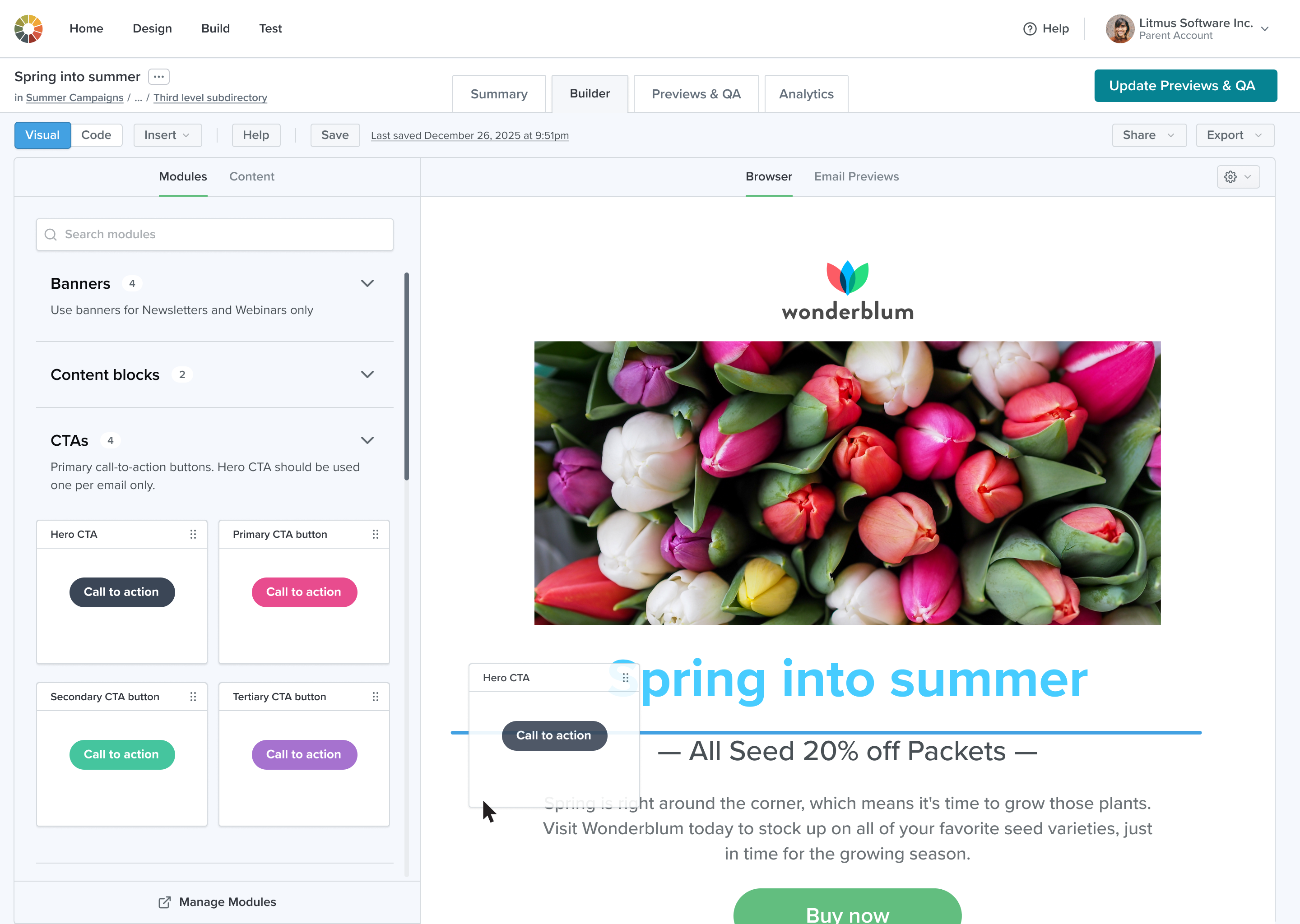
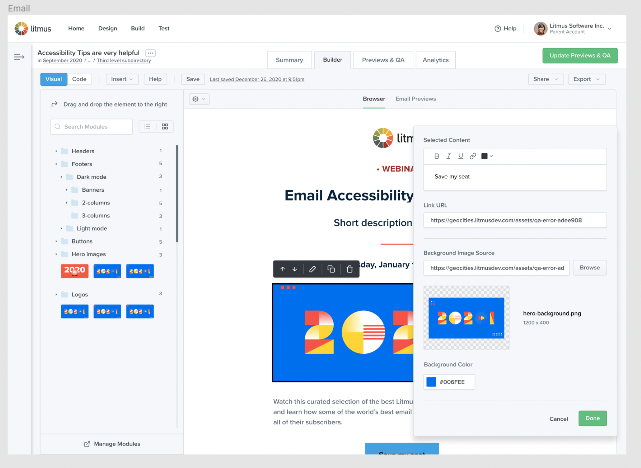
Insert Panel:
Unified module/image insertion in Code Editor
Tabs in Visual Editor:
Accepted divergence for better context-fit
Role-based access:
Simplified experience for non-developers
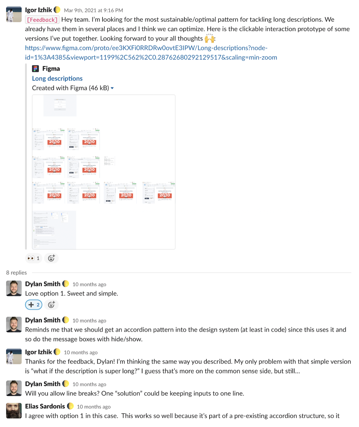
Cross-functional Collaboration
Clear 1:1s and design reviews with PMs and design leadership
Design sessions with engineers and UX team
Async collaboration via Figma, Slack, Confluence, Jira
Shared demos and mid-sprint reviews with stakeholders
Typical quick feedback request in Slack:
UI Explorations
Design options for organizing modules: tags, folders, categories.
An exploration of the ways to present information: flyout menu vs tabs.
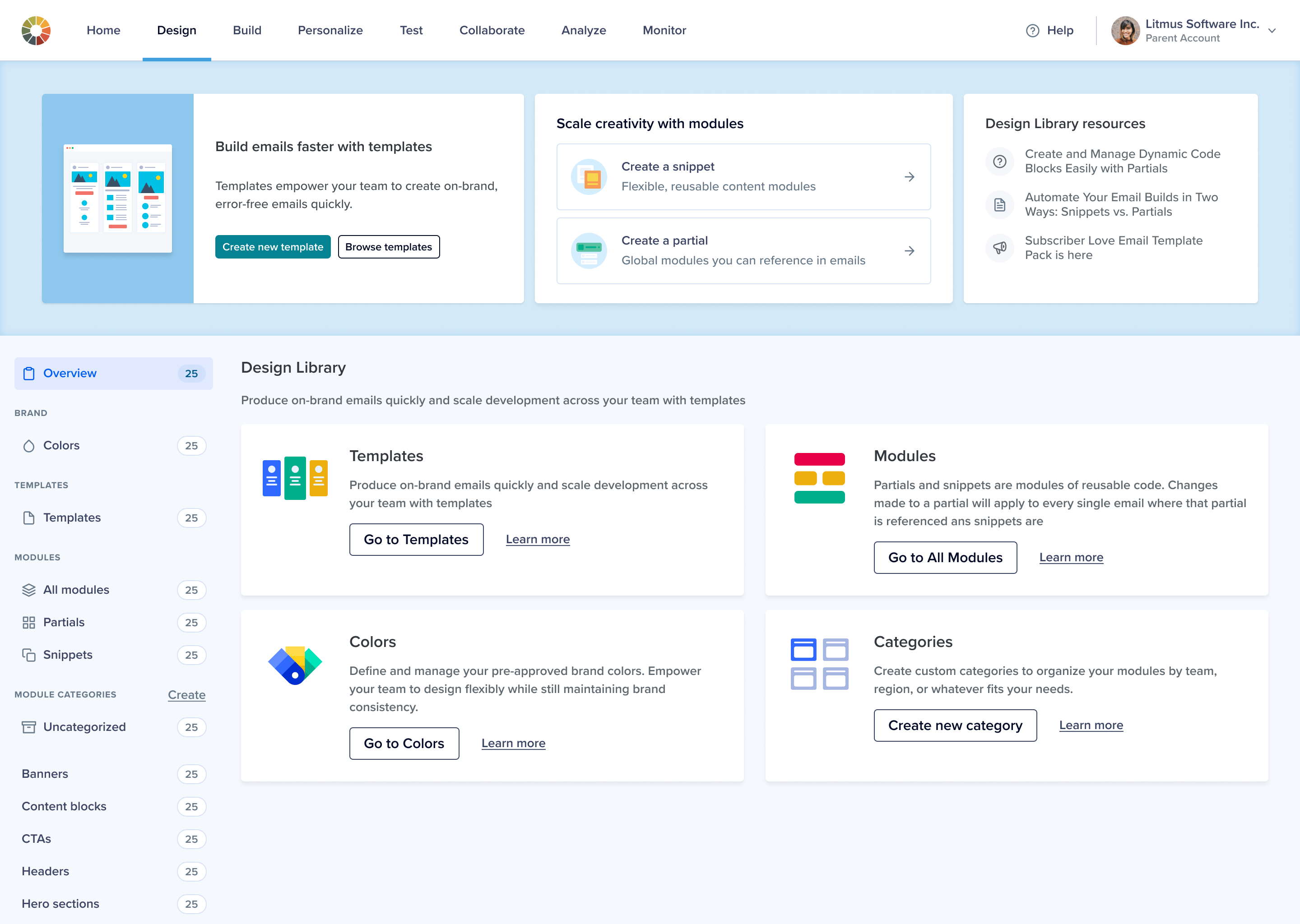
Design Library overview page
Design Library index page
What helped ensure successful delivery
Clear goals and user understanding
Shared, accessible documentation
Continuous feedback and open collaboration
Transparent communication and early sharing
Time buffers for iteration and bug fixing
Design system alignment and implementation support
Traps and wrong-turns
Over-reliance on high-fidelity mocks early on
Modules still not fully integrated into all views
Navigation update delays due to marketing alignment
UI scalability issues emerged with new features (e.g. merge tags)
“Manage Modules” shortcut left out due to time constraints
"Uncategorized" section missed during testing but added later
Lessons learned
Usability testing is critical—and must be done early
Low-fidelity prototypes are essential for communicating scope
Delightful details like "Drop here" boost confidence
Don’t ship what’s easier—ship what’s right
Cross-team coordination is key to a unified experience
Results
The project showed strong metrics, but educating users on the value of modular building remains a key challenge.
A major adoption barrier is persistent distrust of WYSIWYG editors, linked to past experiences with poor code quality.
Success is reflected across three key dimensions:
Quantitative metrics and usage data
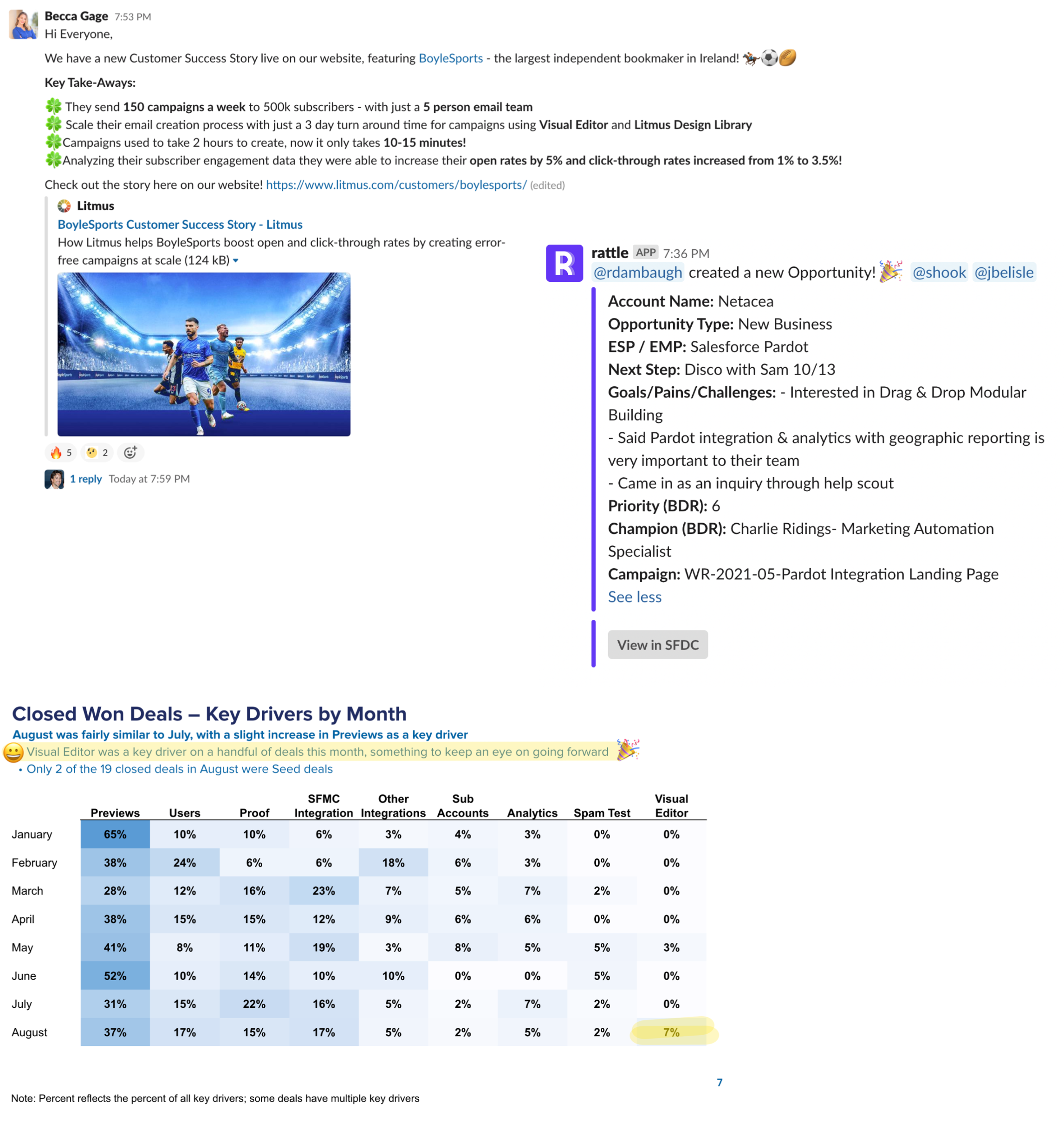
Impact on closing deals and creating new opportunities
Direct feedback from customers
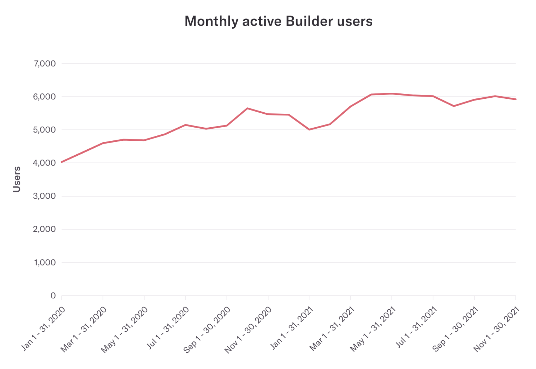
Monthly active users
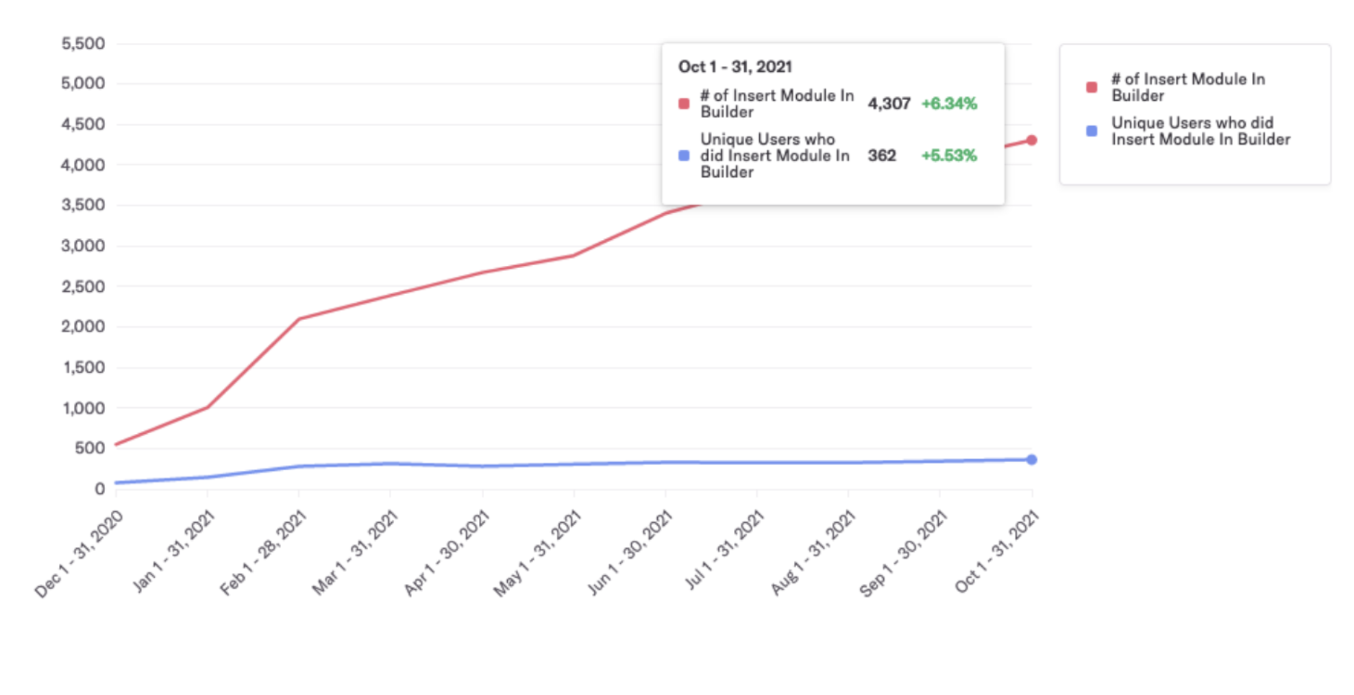
Usage
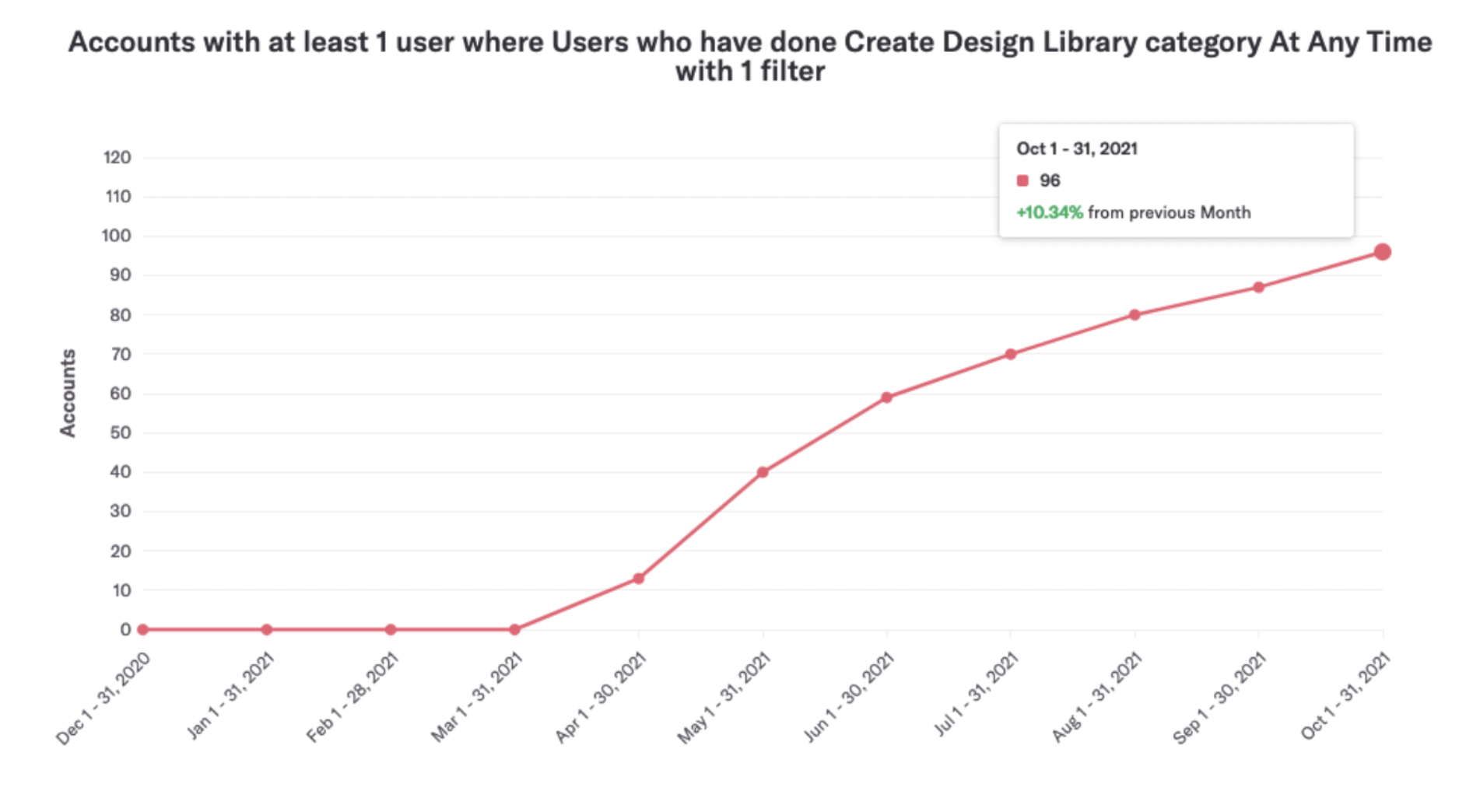
Category creation
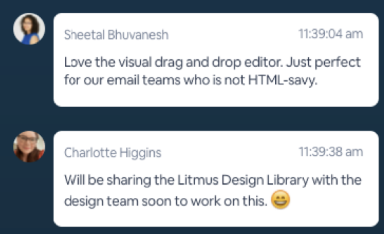
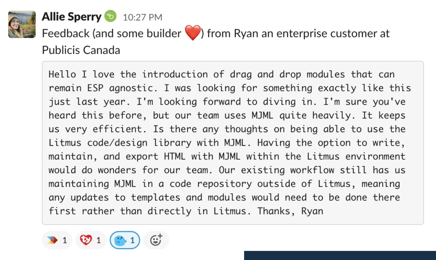
Customer feedback
Customer feedback
Closed deals