Litmus is an email marketing platform offering a robust toolset to help their customers build emails (via Code Editor or Visual Editor), test emails against a myriad of email clients, review emails with stakeholders, and improve email programs by analyzing emails’ performance.
The project I’m describing here is one of the multiple projects that took place simultaneously. For example, other teams were working on navigation redesign that impacted adoption and discoverability of Modular building.
One of the core objectives of Litmus as a company is to scale customers’ email production. Modular building provides a more predictable outcome when creating emails and opens the door for non-developers to work with predefined modules without knowing HTML. Additionally, the more customers create assets in the platform, the stickier the product becomes. The more customers collaborate, the more seats they purchase. That leads to bigger deals and, as a result, higher profits.
Modular building was an organic extension of the work done prior to that, namely Visual Editor (in addition to Code Editor that existed for a while) and basic Design Library containing reusable modules like code snippets and partials.
Although customers were able to create modules and templates in Litmus, it was painful for both non-technical team members and email developers to use those modules. They had to switch between different areas of the product and/or memorize the names of the modules in order to insert them into the email’s HTML. Visual Editor didn’t even have a capability of using pre-built modules and was simply working with existing HTML.
Customers were not entirely happy with solutions from their Email Service Providers (the systems that do the actual Send of the email campaign to the company’s subscribers lists), trying to avoid poor email building experience as much as possible.
Additionally, there were signals from the market showing a broader need for modular building—a number of thriving relatively small competitors like Stensul, Dyspatch, Knak, etc.
The informed assumption based on market research was that allowing customers to use modular building would result in more and bigger deals (estimated growth up to 15%), competitive advantage, and pave the path to other features like supporting personalization via allowing customers to insert merge tags (think variables in HTML). The project also targeted a new persona—non-technical content editors.
Based on customer’s feedback and business opportunity, the team decided to bridge Design Library and Editors in order to make it possible for different types of users to easily use modules in their email creation process.
Here is a handful of quotes from customers collected during UX research:
“I want to enable non-technical people at my company to build their emails from templates and modules I control.”
“If we had this, we could build emails a lot faster.”
“I want new team members to be able to get up to speed faster, I want to drag-and-drop modules.”
“Pain points where we duplicate efforts. Creatives are designing full layout in Figma and then that all gets redone. Drag and Drop editor ... can select module to pass to creatives.”
Sidenote: Litmus practices Continuous Discovery as part of UX research. Every week Product team members speak to customers who are willing to share their thoughts and needs. During those interviews information is gathered about how customers use Litmus and the pain points they experience. Continuous Discovery program helps uncover product opportunities and provides a better sense of who our customers are and what they need to be successful.
The team:
My responsibilities included:
A one-pager, a document outlining the problem, evidence, and user needs was created to align multiple teams on the problem and the “why”.
The design plan included:Along with the above, increased retention and upgrades from lower to higher plans were desirable nice-to-have outcomes.
Below is a handful of artefacts created during the design process
Competitive analysis and inspiration board
The project was iteratively developed within two quarters: Q4 of 2020 and Q1 of 2021.
The idea behind quarterly releases is that the Marketing department has enough time to develop a strategy to promote new features to customers, create supporting materials and train Sales and Customer Support departments.
The project was developed in a staging environment behind beta flags and gradually rolled out to customer segments. First, to the customers who expressed interest in beta release, and then up to the whole customer base.
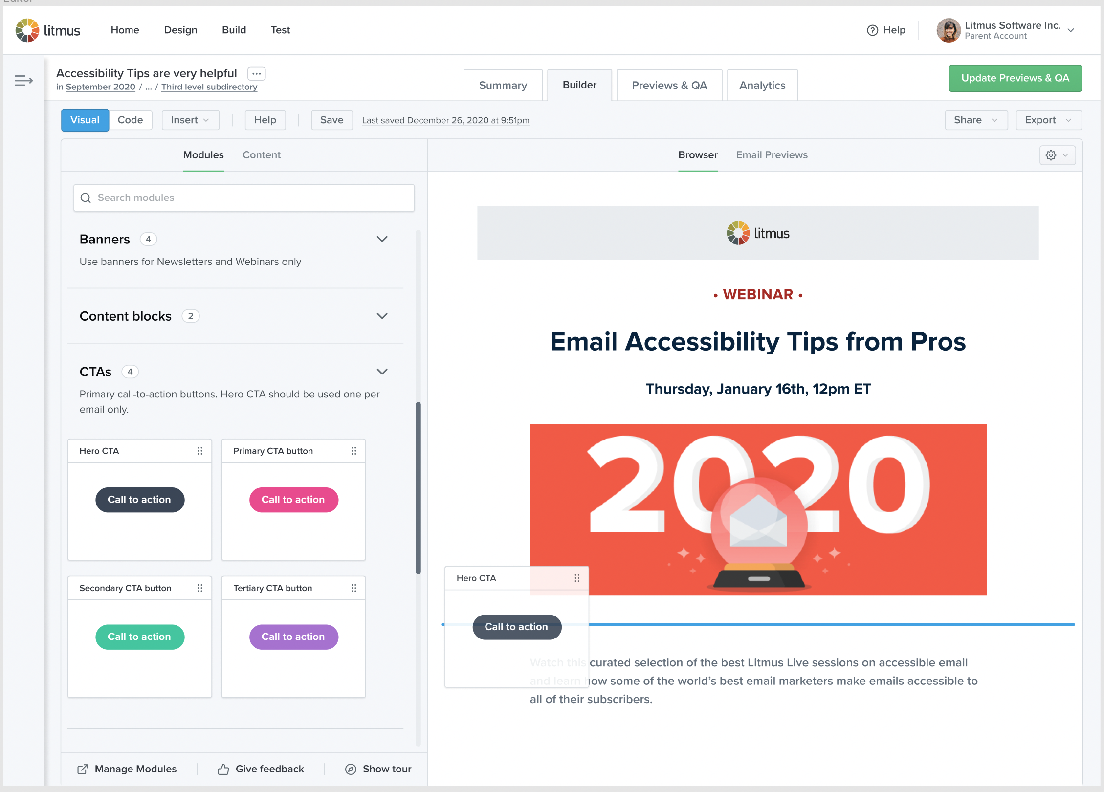
Introducing Categories as a way to organize modules versus common UI patterns that already existed in the app:
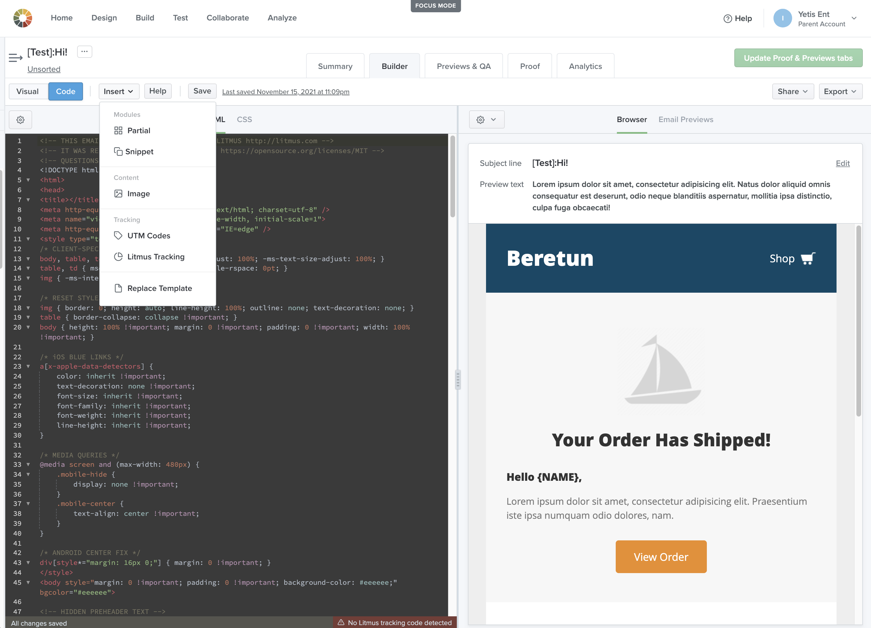
Introducing Insert panel in Code Editor as a single source of modules and images since there was additional content on top of modules that could be inserted via the Insert menu.
Introducing Tabs in Visual Editor versus a panel or modal. We were fine with diverging experiences in Visual Editor and Code Editor since in Code Editor there was additional functionality like inserting images and copying code without inserting it, as well as managing modules. Plus, unlike Code Editor where the code area needs to be visible at all times, it’s not required for Visual Editor.
Introducing new user roles that have limited access to Design Library, a source of truth for coded modules created by email developers who care about the quality of code.
On top of the bigger design decision, there was a slew of smaller things figured out:
I’ve created a document with design decisions and trade-offs for the team and stakeholders to better understand why certain decisions were made at that point of time. Below is a screenshot with a few of the decisions made working on the drag and drop experience, accompanied by reasoning.
The scrum team is pretty autonomous in terms of decision making so there is no micromanaging from executives. However, there are regular recurring meetings to discuss the work in flux:
Weekly 1:1’s with the PM, where we discussed the overall design direction, planning of the project, core functionality, future vision, testing scenarios. Design collaboration sessions twice a week including Design Director, product and marketing designers, UX researcher, UX engineer. Most of the design feedback came from that meeting. Weekly Design Reviews include: Director of Design, Director of Product Management, Product Manager. Documentation in Confluence provided the way for anyone at the company to get familiar with the project and provide their input and thoughts. Documentation was regularly shared in Slack with multiple teams for transparency, feedback and dependency management. Bi-weekly demos, including engineers, marketing, product managers, VP of Product, VP of Engineering where anyone is welcome to ask questions, question assumptions and see all the work that was done in a sprint. Bi-weekly mid-sprint reviews include the scrum team and are designed to check up on the progress, identify blockers and course correct if necessary. Bi-weekly sprint retros with a scrum team are intended to discuss how the next sprint could be improved based on the previous results. Weekly design system sessions are about discussing how a particular project would use design system components and if there is any work needed to create new or adjust existing. Weekly Product team Huddle is designed to discuss the new initiatives that come from research and the progress on the current ones.
A lot of communication happened asynchronously: feedback requests on shared Figma documents via Slack, collaborating on design solutions and ideas in Slack and Jira, pair coding and styling, knowledge exchange.
Clear and concise documentation, constantly shared, available and cross-referenced everywhere to inform of design decisions, objectives, customer needs.
Constant feedback loop at all stages from multiple sources: design team, customers (research, usability testing, gradual roll-out), stakeholders (demos, 1:1’s, collab sessions), the scrum team (collab sessions with engineers, design review of the code). Share early and often, regardless of the readiness, “too ready too late”.
Overcommunication: sync and async via Zoom, Slack, Confluence, Google Docs. Ideation sessions and retros after each sprint on what went well and not so much, what needs to be done to course correct, bottlenecks, unknowns. Reflecting on progress and asking for help if needed.
Transparency: all the work the team was doing was available to anyone at the company and stakeholders were made known of the plans.
Embrace change: as a designer I always let the team know we are working together and my job is to find the right solution not to provide one. Constant feedback from the team and stakeholders and customers helped.
Plan some buffer time to address bugs and changes required based on usability testing and customer feedback. Coordination with marketing, sales and engineering is key.
Positive thinking and don’t forget to have fun while working hard.
Clear scope, objectives and timeframe.
Aligning on a problem and ways of solving it.
The trap of “an abandoned project” is one of the painful ones for me. Until now the modules are not playing nicely with grid/list views and the team focused on the next project. I should have been more adamant about making everything work perfectly before jumping to the next thing.
Adding Design item back to the main nav was a 6 months endeavor since Marketing created all of their help articles and videos and wasn’t cooperative about changing it. We had to go through testing to just prove that it needed to be added back to the main navigation.
Not necessarily a wrong-turn but a scalability issue. Now we are working on personalization and that implies there should be a mechanism of adding a merge tag into the email. Tabs that were used in the insert panel are out of space, so there will be an added headache of how to add one more item or redesign the whole thing. It’s not a problem as of now, but anything on top of that will require redesigning of the panel.
I’d love to have a “Manage modules” link at the bottom of the Modules panels to allow customers to quickly jump to the Design Library, but we didn’t have enough time toad that. I’ve tested in code how that would look like to have three buttons instead of two, but the team moved on to the next project so that was left out.
We had to add an “Uncategorized” section later to include all Modules that were not in one of the categories. That’s something that slipped through the usability testing, but we managed to add that in within the timeframe.
First off, usability testing is a must have. A good number of participants had mistakenly deleted the module itself instead of removing it from the category. We reacted promptly and added a menu item to the contextual menu to avoid that scenario. Also, a safety net of introducing a dialog asking if the customer wanted to delete the module was put in place. Destructive patterns need to be addressed as soon as possible.
Usability testing uncovered some problems that were addressed, but due to participant recruiting problems, usability testing overlapped with development. Should have been done sooner so that we had results before development to avoid scope creep.
“Edit categories” was also added to the context menu as part of the usability testing findings. I’m very cautious about duplicating the same functionality signifiers in multiple places but this time was the last drop.
Low fidelity prototypes are beneficial for communicating the level of completion to external stakeholders. Although there are benefits of the high-fidelity mock-ups (like making it possible for stakeholders to insert those into presentations and documents that will be shared with external teams; UX research participants are much more willing to interact with something that looks “real”), that’s not the reason not to do wireframes as well.
Test and try to break everything: there will always be an edge case that you forgot to account for.
Usability testing showed that “Drop here” signifier in the email body helped customers to feel safer when dragging and dropping modules. That was added to the blue marker that appeared at the module insertion point. Delight and reassurance is important.
Avoid biases. One of the examples: “Let’s use folders, we have them in the email list, it’s easier to implement than building new functionality”. No, build what’s right, not what’s easier.
Encouraging other teams to share and coordinate their work is paramount. New navigation caused a lot of problems with discoverability my team worked on.
The project targeted a new customer segment —Code Editors and Content Editors, non-technical folks. Modular building was marketed as “a feature to help non-technical folks build emails easily”. However, findings from an adjacent project showed that Visual editing was even more relevant to coders since there was a need to jump in and check if the email was built correctly. Plus, it’s a great way for email developers to speed up their process when changing content. As a next step I suggested conducting more research to see if positioning of the feature could be expanded.
Adoption and promotion of the feature is important. New capabilities should be highlighted somehow for customers in-app to mitigate the “I don’t have the time to learn the tool” and “I didn’t know it existed” problems. That’s one of the big problems at Litmus since a lot of customers are just used to their ways of working with the product and many don’t even know about new features that would streamline their workflow significantly.
Cross-department collaboration can be hard. It took more time than expected for the Marketing team to approve navigational change after the above-mentioned redesign of the main navigation went live. When both projects were rolled out, we saw a significant drop in usage of Design Library as there was no quick way to navigate to it.
It’s hard to tell how the feature impacted major outcomes, overall retention, for instance. It’s difficult to attribute increased growth numbers to that particular effort if there are more teams contributing with the same objectives.
One of the core issues uncovered during the roll-out was lack of trust in WYSIWYG editors available on the market, which happened to add more code than needed to HTML. Common bias that we still need to dismantle but that requires some bigger educational effort.
The project paved the path to more features like inserting merge tags while working towards Personalization, one of the top three customer needs uncovered during a broader UX research initiative.
Although the project showed positive numbers, there are still issues that need to be addressed. The core issue is simply educating users on how Modular building benefits their email creation workflow. Another more serious preconception to battle is the above mentioned lack of trust in WYSIWYG editors on the market.
The screenshots below represent three buckets of what, in my opinion, defines overall success of the feature: numbers, help in closing deals/creating opportunities, and customer feedback.
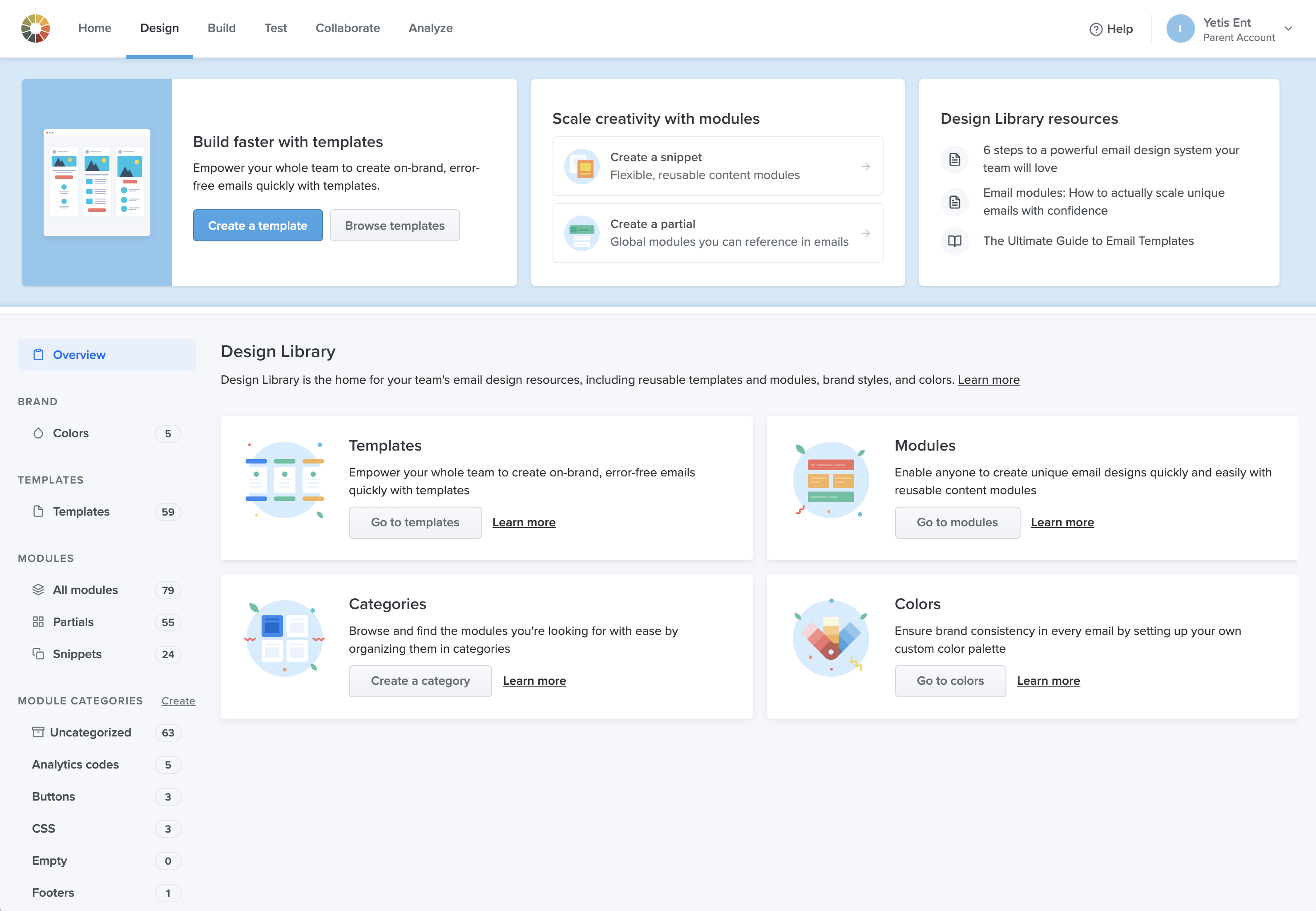
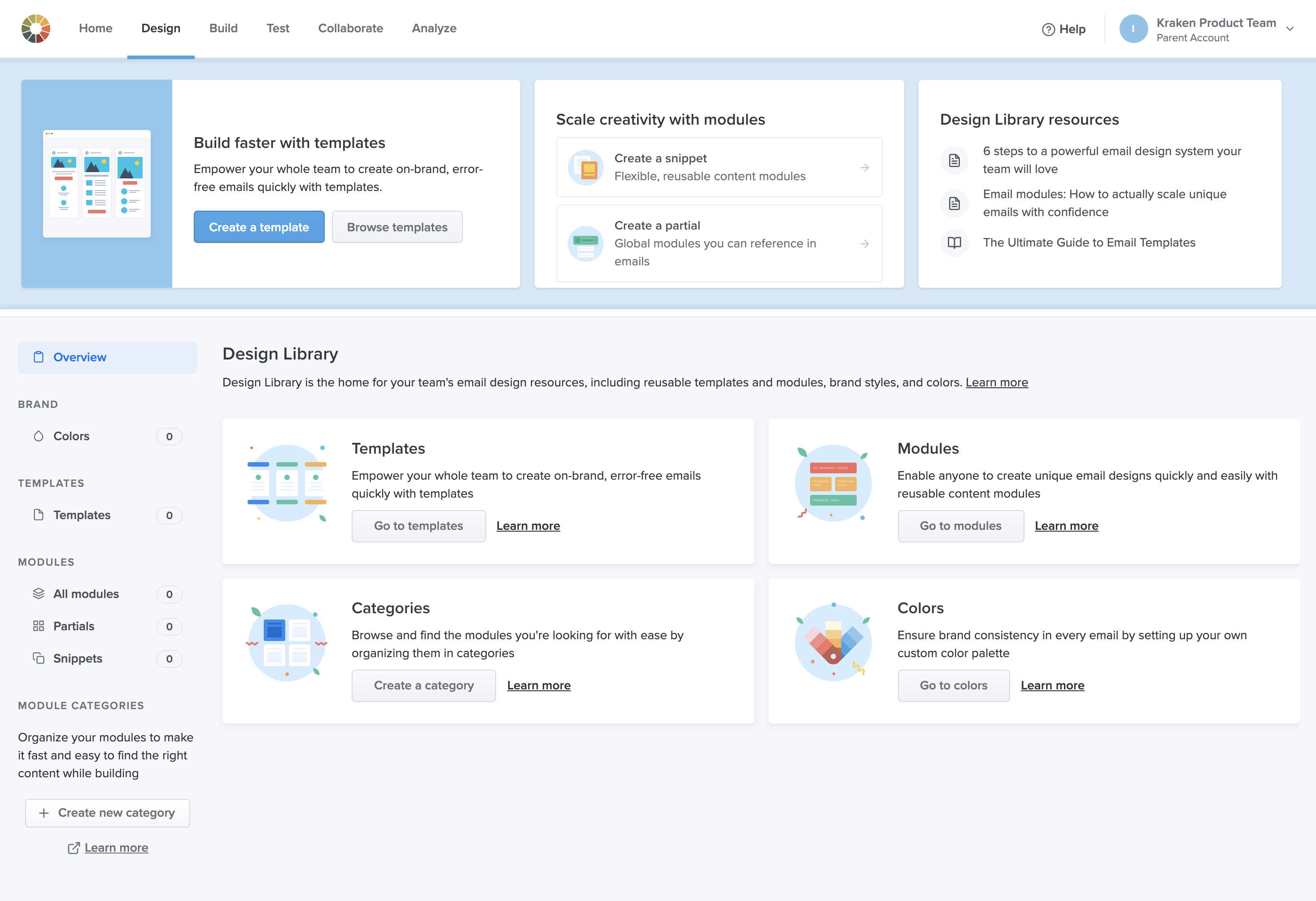
Design Library overview page
Initial Categorized Modules in Visual Editor
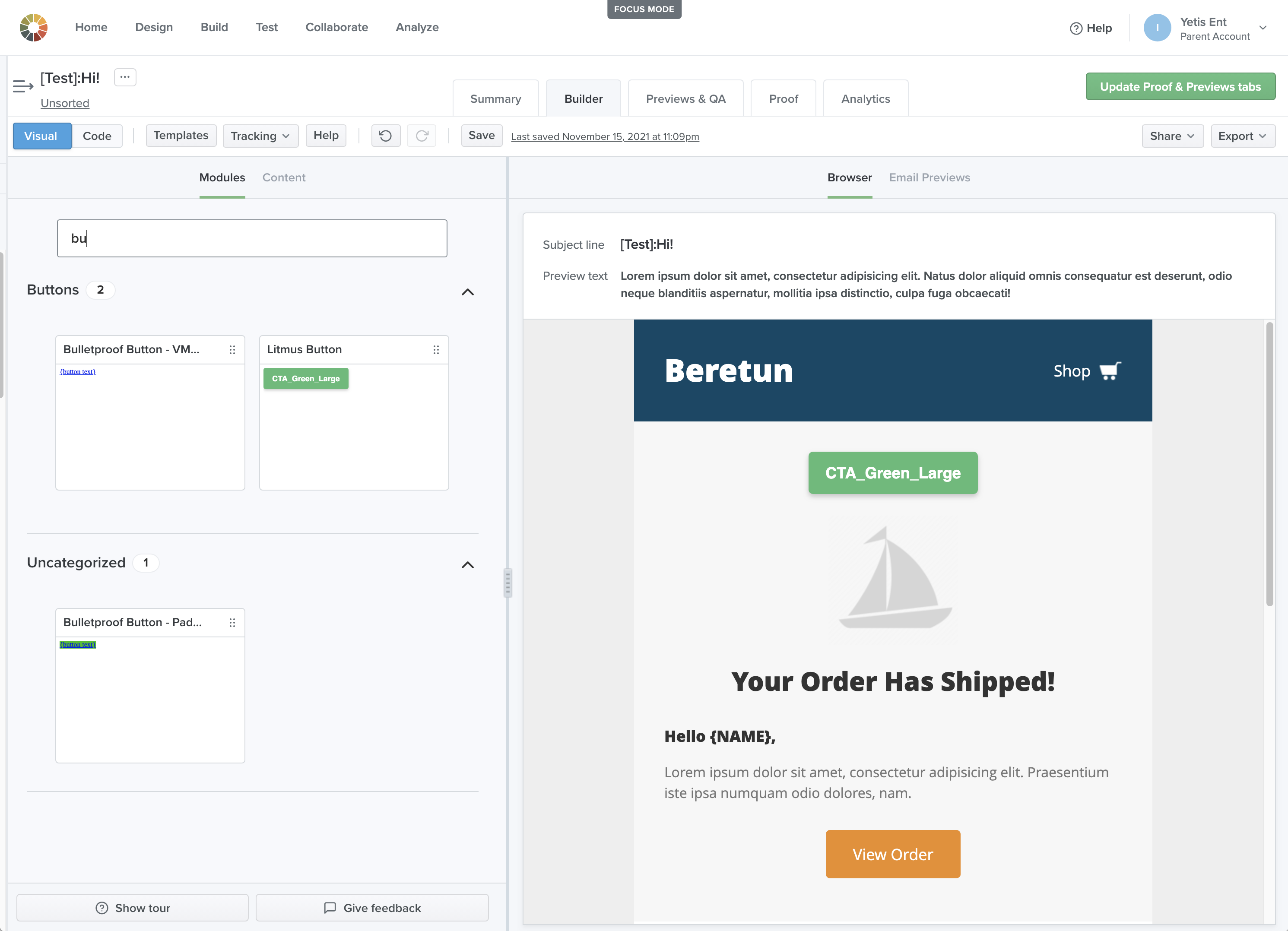
Adjusted Categorized Modules in Visual Editor with added description interaction and loader
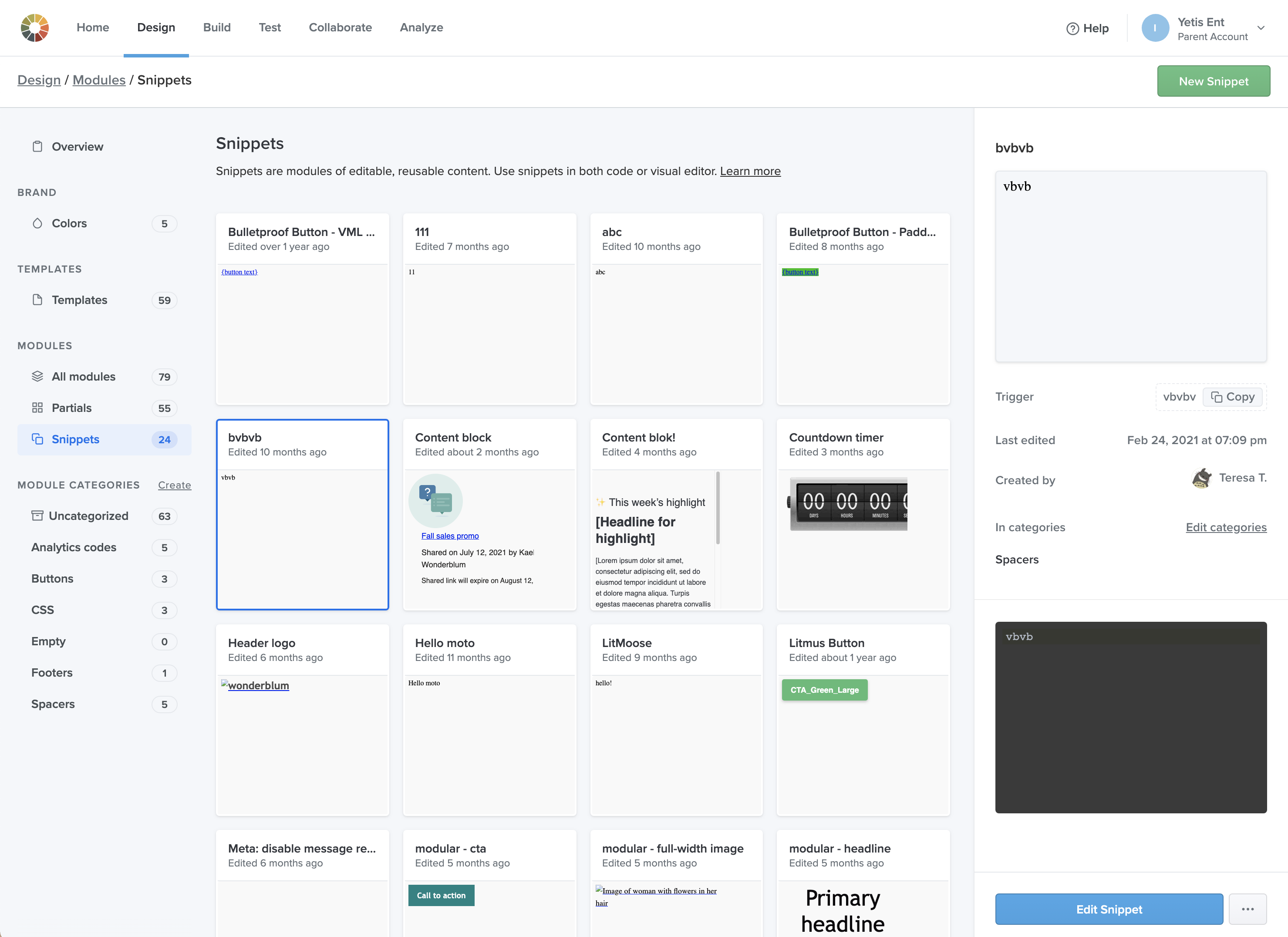
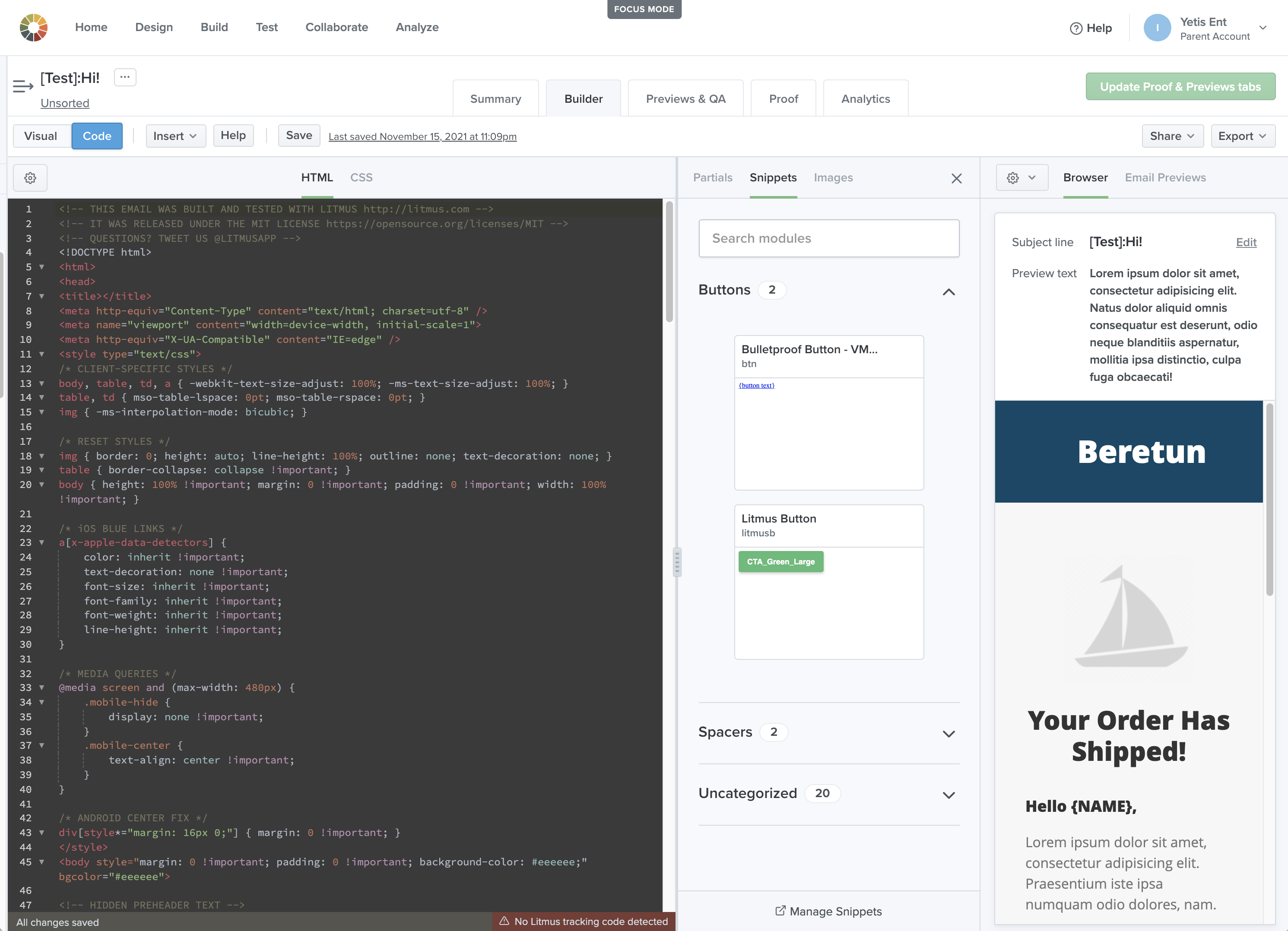
Design Library: Snippets page
Initial drag and drop interaction
Adjusted drag and drop interaction with “Drop here” signifier and “Uncategorized” section.
Insert panel in Code Editor